Overview
Branding and website creation for a local nonprofit organization located in Seattle, Washington to help improve their community outreach efforts.
Timeline: February 2021 – March 2021 (6-8 weeks)
Team: Designer x 1
Role: UX Designer
Skills: Heuristic Evaluations, Prototyping (low-fi & high-fi), Brand Design, Website Development
Background
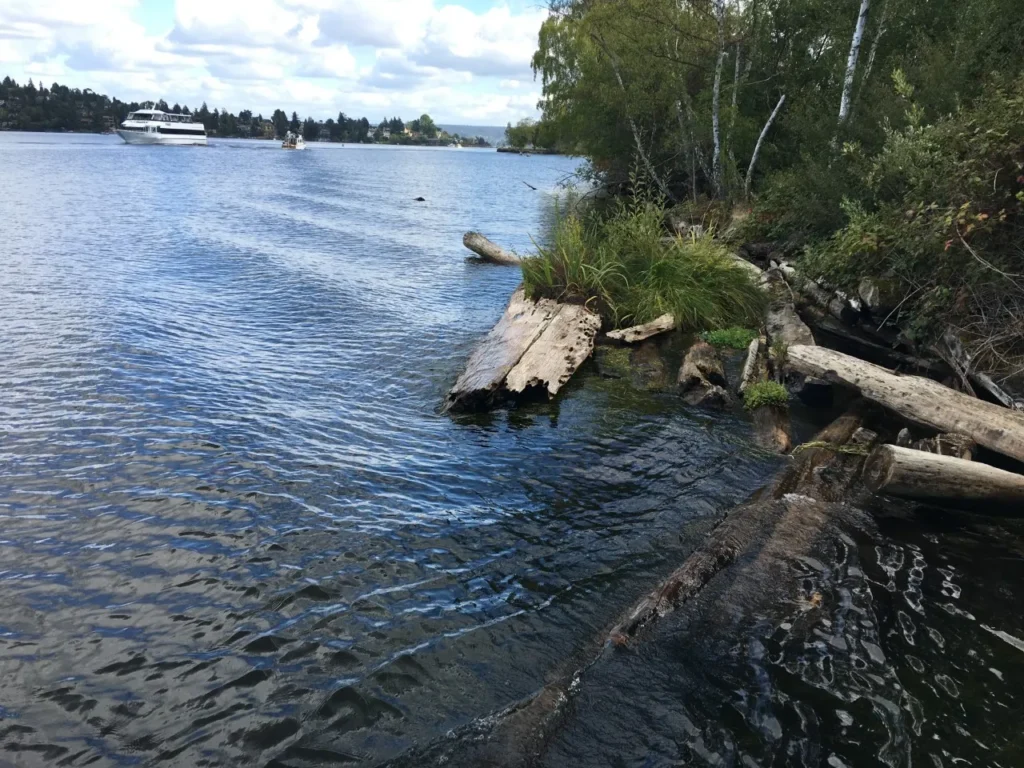
Save Union Bay Association (SUBA) is a 501(c)(3) non-profit environmental conservation organization that helps monitor the ecology of Union Bay in Seattle, Washington. Run by neighbors that live in the nearby area, the organization has helped reduce and manage invasive species in the area by obtaining city and state grants and helping fund annual surveys of the Bay.
Problem
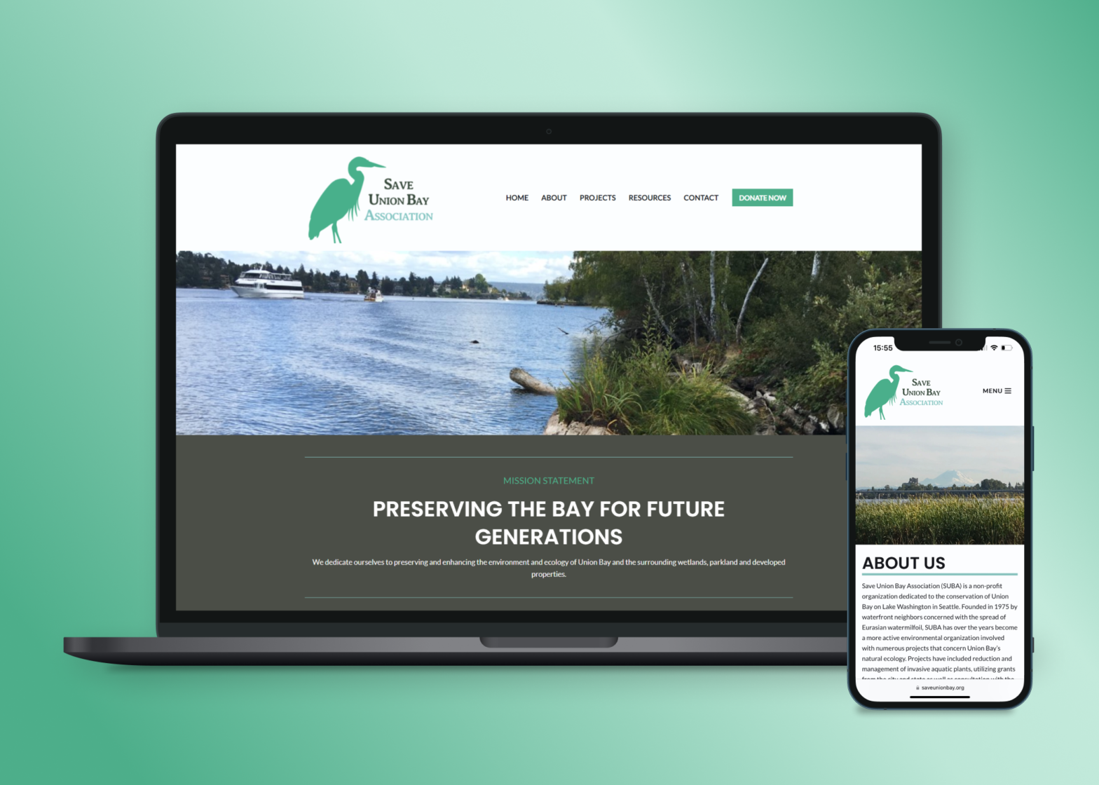
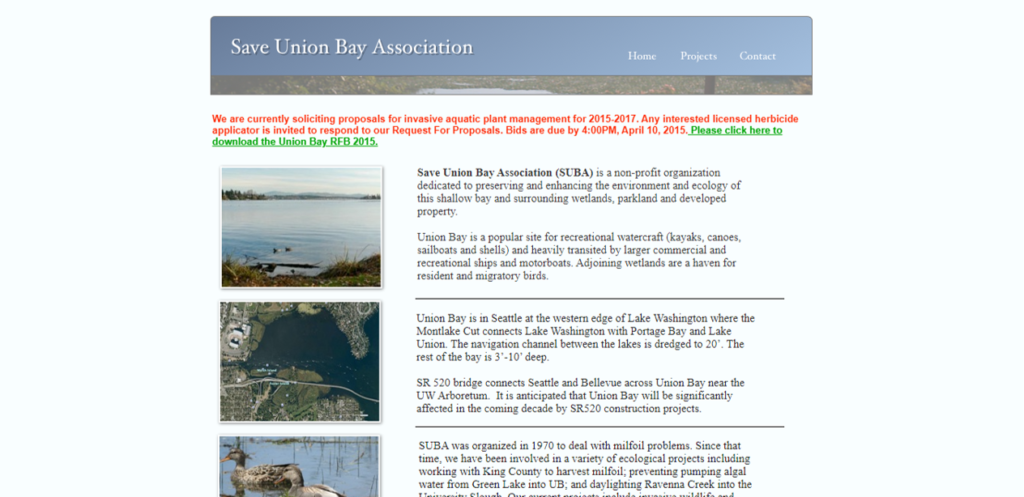
With the organization’s website builder deprecated a few years prior, the website for the Save Union Bay Association was not able to properly communicate current projects and works either on the website or across devices. They needed a new website that that would be responsive across devices and allow for more efficient communication to their community, donors, and other relevant stakeholders.
So how can the organization use their website to better brand themselves and improve outreach efforts to their audience?
Research
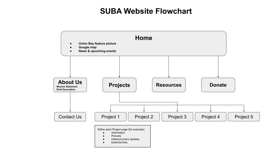
Understanding that the organization needed roughly 10 pages to advocate their projects and brand, I began envisioning the expected user flows throughout the site. I started with an initial information architecture flow chart to get my design process focused.
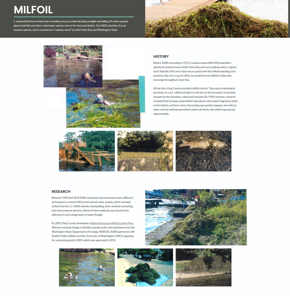
To further understand design needs, I further versed myself about the projects Save Union Bay Association had worked on, which included milfoil control, nutria removal, and consultancy on state government projects such as the SR-520 construction and the passenger-only ferry study.
Design Principles
Based on my findings, I was then able to establish a couple of key design principles of what the outcome of this site should convey.
Design for Approachability
As a local nonprofit, this website needs to quickly communicate to their current and potential stakeholders what they do and their impact on the community as an environmental conservation organization.
Design for Simplicity
With the two primary user flows of the website being receiving donations and informing of project updates, this website should be simple with its design and not overly-complex in navigation.
Establishing Brand and Design
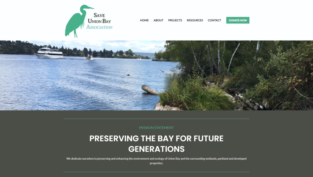
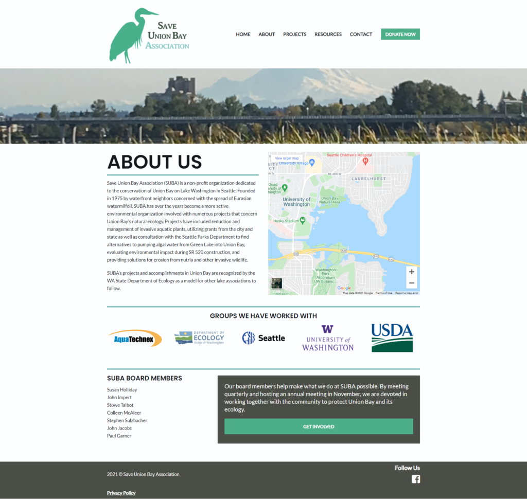
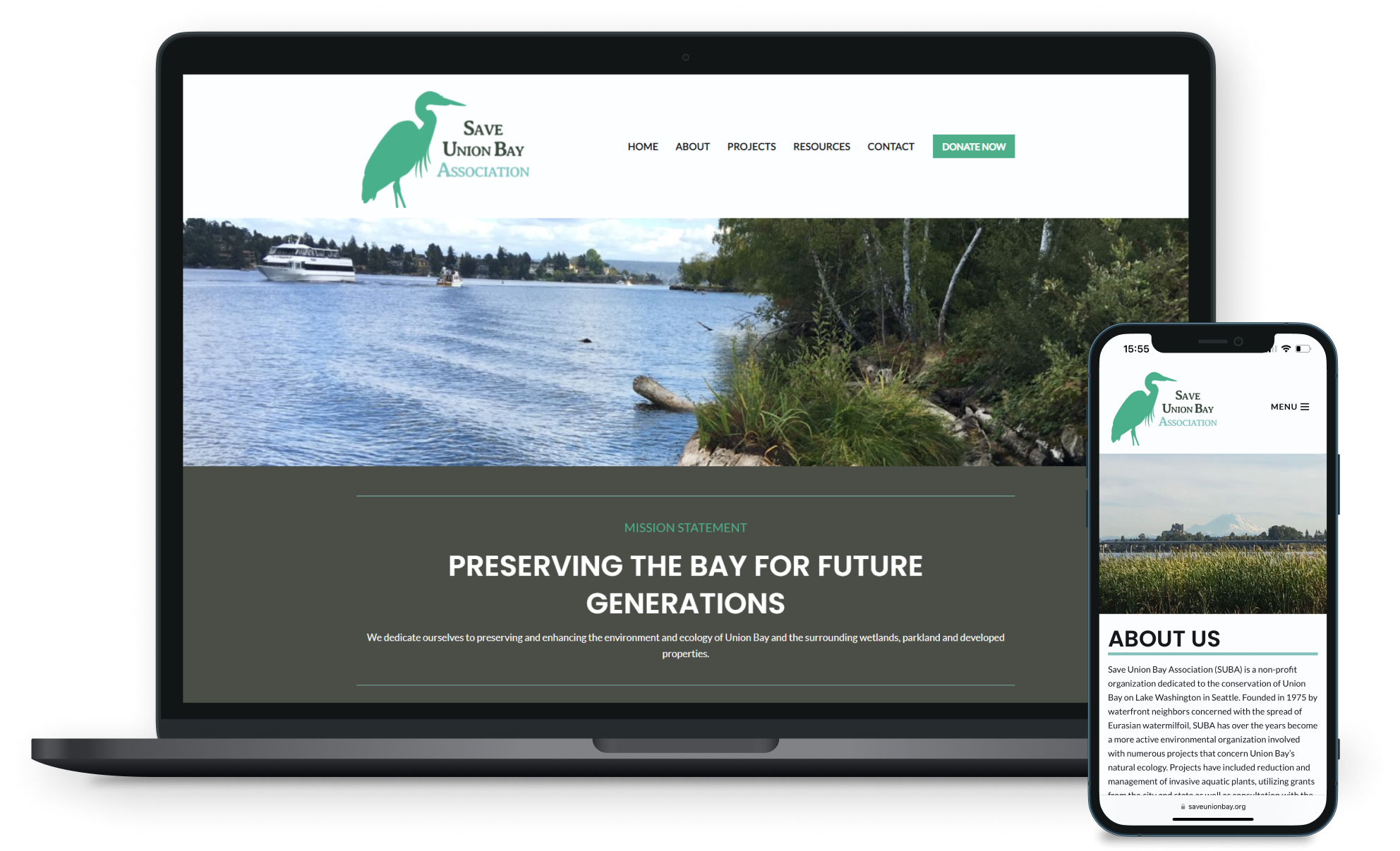
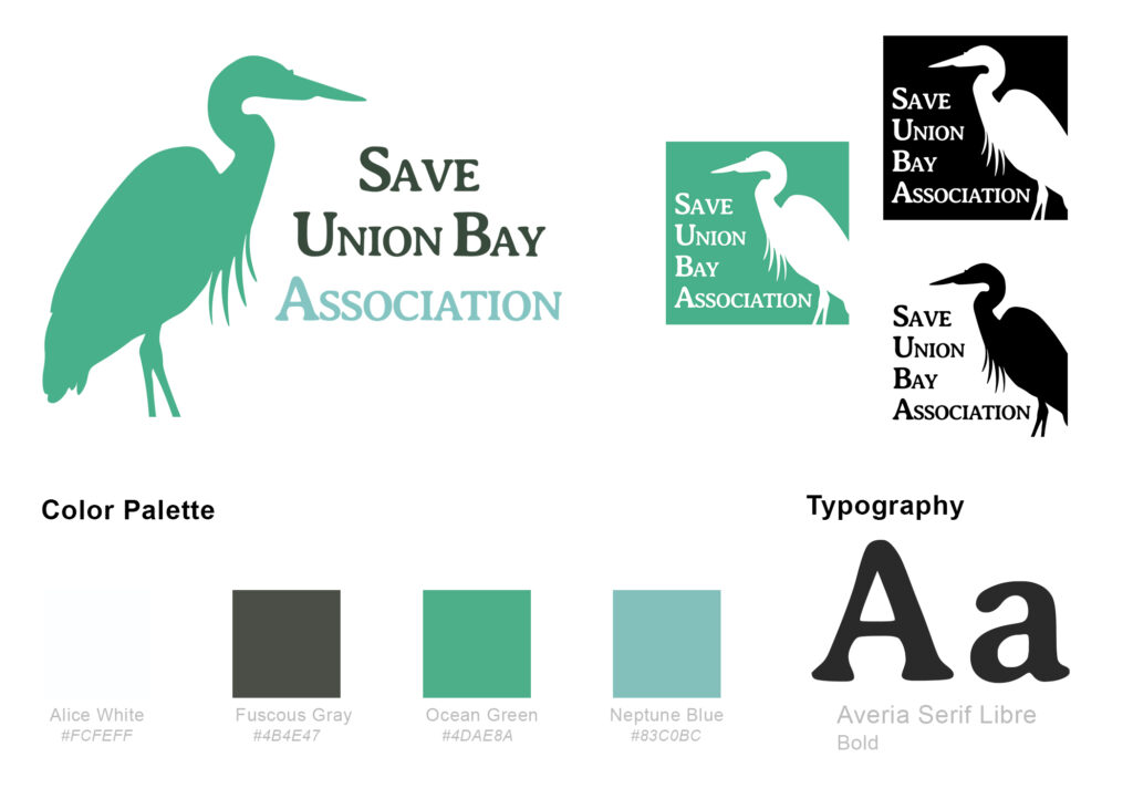
To create a strong yet approachable identity for the nonprofit organization, I had to envision their brand by introducing and establishing a logo. To start out with I used earthy and natural colors that mimicked elements associated with lake water (greens, blues, browns) and selected a playful font with rounded edges to convey approachability. To further emphasize the organization’s goal for environmental conservation, I introduced the silhouette of a great blue heron, a native wetland bird in the Pacific Northwest, into the branding.
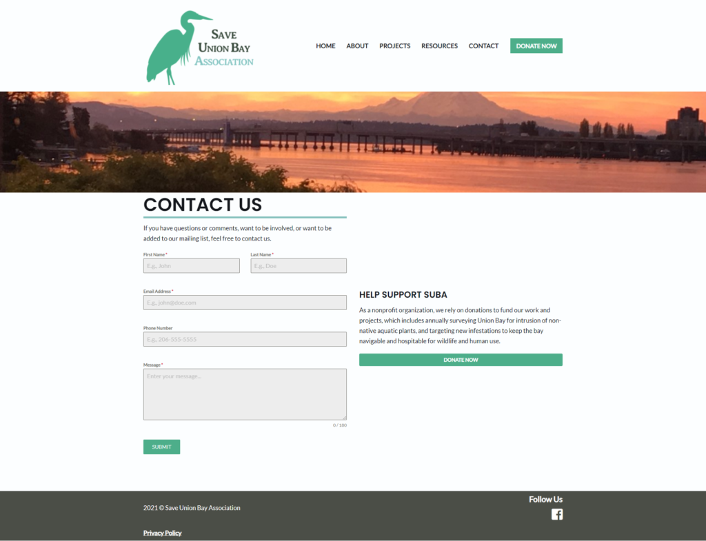
Already having the desired content and artifacts that the organization wanted to use on their new site, I was able to quickly whip up a high-fidelity prototype. For written content, I used simple words and applied a storytelling method for a more conversational and engaging tone. This overall helps make the site’s content quickly digestible for users who might not be as well versed in the environmental conservation space.
Website Launch
Using these prototypes and to make the design responsive across devices, I developed their site with WordPress which took a few weeks. By late March 2021, I finished development of their site, and Save Union Bay Association was finally able to unveil their site to the public.

What I Learned
Start simple
Breaking my process down step-by-step before starting my prototyping process allowed me to be clear in communication with the organization throughout my design process, which helped speed up the process of getting the website from design into development.
