Overview
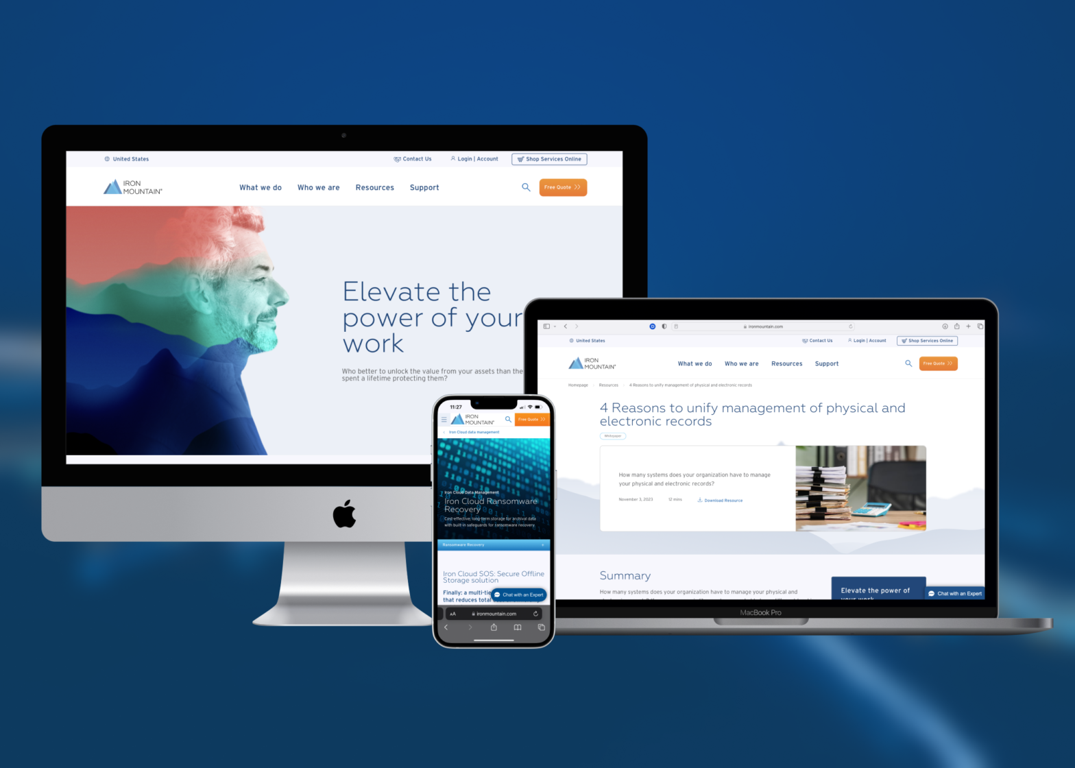
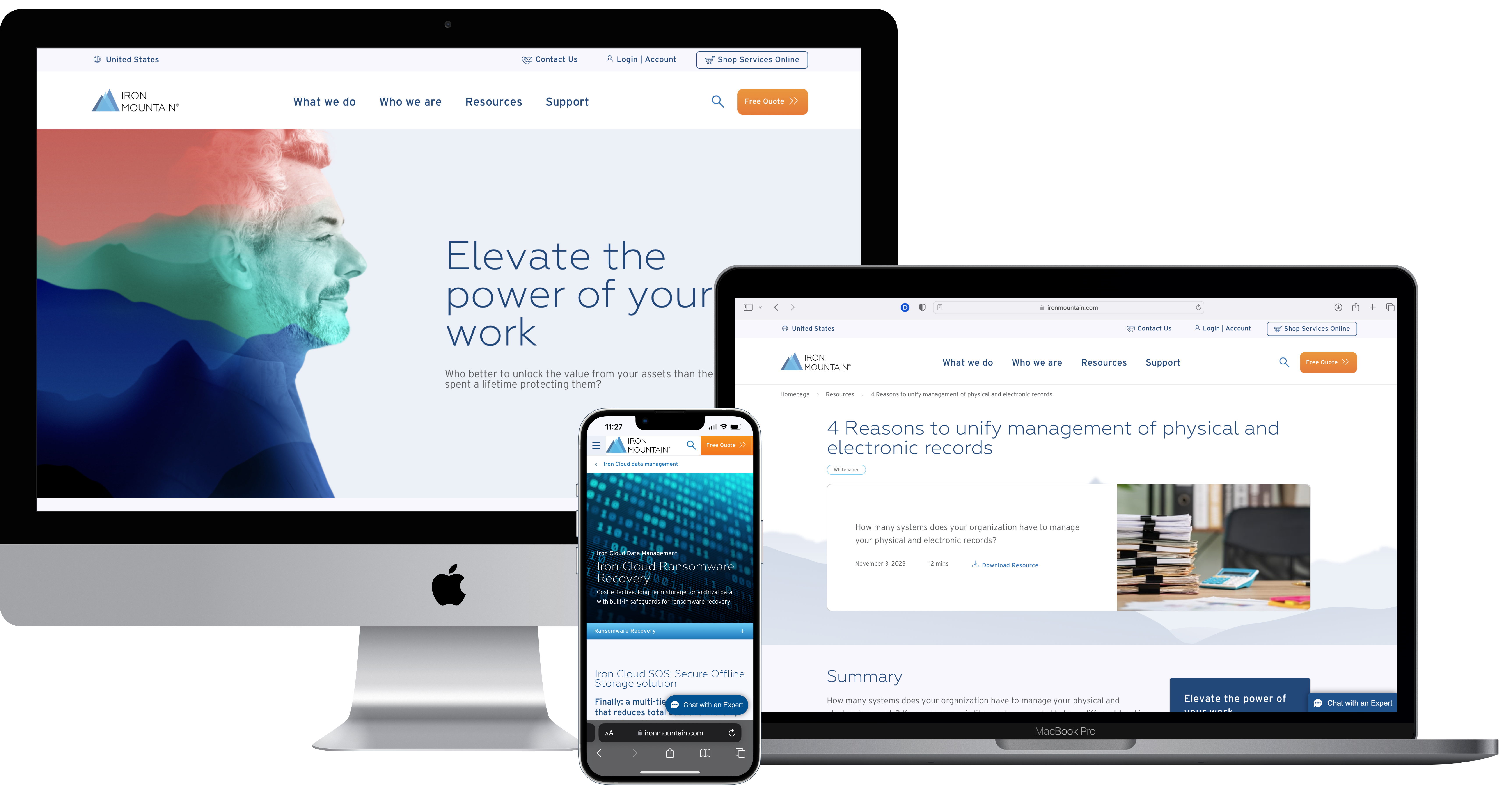
In May 2023 I joined the Iron Mountain digital marketing team during the rebrand and redesign of the www.ironmountain.com marketing website. With my assistance I oversaw the design and development of 50+ web components, and implementation of content across webpages across several countries.
Outcome
A simpler content management experience, creating and localizing web updates both in a numerous number of ways and with ease.
Teammates:
1 x Designer (me)
1 x Copywriter
2 x Digital Marketers
Manager:
Lulu Xu
Timeline: May 2023 – November 2023
Role: UX Designer
Skills: Visual Design, Content Design, Information Architecture, Heuristic Analysis, Content Audits, Project Management, Communication
Background
Who is Iron Mountain?
Headquartered in Boston, Massachusetts, Iron Mountain (IRM) is a B2B company most known for their Records and Information Management services, alongside their Digital and Asset Lifecycle Management services. Wanting to improve their global presence, expand upon customers’ digital experience, and increase exposure for other services, Iron Mountain began taking steps at the beginning of 2023 to overhaul and redesign their marketing website, ironmountain.com.

Problem
Modernizing and Localizing Content Stresses

Having a global presence in over 60+ countries, the sheer amount of content on Iron Mountain’s marketing website was in general hard to maintain – not just across services but across multiple countries as well. In result – lifespan of page content were shorter, content inconsistencies were reproduced across regions, and the website as a whole was perceived more utilitarian rather than informative.
Needing a refresh on their design and informational structure, I wanted to understand how a new design could provide Iron Mountain the much needed simplification to help the digital marketing team improve and maintain website content – and thus better communicate at a global scale.
How can Iron Mountain better use its website to communicate its services/offerings/all the above to current and potential customers?
Research
Learning about Iron Mountain’s Content
In my onboarding process learning about Iron Mountain’s website from the marketing perspective, I paged through the newly released Brand guidelines that would be used on the new Iron Mountain website (the updated Brand was launched June 2023), along with an initial passthrough on the current design and layouts of multiple webpages. In further immersing myself in the problem-space, I talked with my team and vendors to get caught up to speed on the redesign efforts and why they were needed.


Initial Design Insights
Doing this audit on the old site and its current components, I was able to identify a few pain points about the website that significantly stood out to me.
Complex information architecture structure
Navigating the site and understanding what each service would cover at a quick glance was not very intuitive, and highly confusing to me as a new user.
My teammates at Iron Mountain also articulated this pain point when talking about localizing content edits across multiple web pages due to the sheer size of the site.
No clear user journey for expected outcomes
Tying into the sheer amount of content that Iron Mountain provides on its website, needing to cover use cases for multiple services across many industries and countries made understanding the customer’s overarching goal much more overwhelming due to the site’s sheer size and nature.
Lots of conflicting visuals and colors
One of the biggest key items that I noted from my initial design audit was that there was a lot of visuals and colors on pre-existing components (CTAs, headings). This, for me, made the website feel both non-cohesive and unstructured.
In my pass-through I also noted that I found it difficult to determine what information my eyes needed to focus on with the wide variety of colors.
Ideation
Reimagining the Content Management Process
When thinking about design ideas, I quickly realized that there were many stakeholders and perspectives that needed to be taken into consideration for this project outside of just Iron Mountain’s customers; ranging from the digital marketing, web specialist, and IT perspectives for content implementation and maintenance on one end, all the way to the enterprise Brand team supplying and guiding the visual direction on the other.
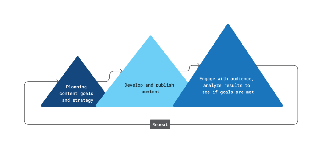
With this in mind, I needed to work out exactly how the content management process would look like for Iron Mountain website (from both the content and visual perspectives), and what would best result to improve both content maintenance and lifespan. The diagram below showcases a simplified process of what the content creation process looks like in general.
Visualizing New Components and Design System
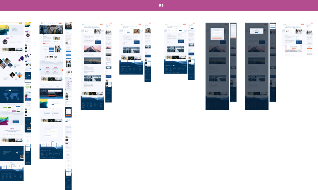
Since a majority of user insights were already discovered from content audits and user interviews when I onboarded, one of my first tasks was overseeing the creation of a design system and web component mockups that the digital marketing team would be using to format content.
In addressing current website deficits, the vendor contracted to Iron Mountain supplied mockups where components would draw attention to the Iron Mountain brand in a way that would not overwhelm its content.
Design Principles
Based on approval from my first batch of feedback internally while understanding the content creation process and goals from Iron Mountain’s digital marketing team, I grounded myself amongst the following three principles that helped reinforce design outcomes for Iron Mountain’s website redesign:
Design for Simplicity
The new designed web components need to be simple both in showcasing content as well as creating it for better content focal points.
Design for Versatility
To ensure use cases for the Iron Mountain digital marketing team are met, the new web components need to be innovative such that content can be laid out in a plethora of different ways on a page – especially when scaffolded for desktop.
Design for Innovation
With a need to focus on content presentation, the designs for web components need to visually stand out in a way that make Iron Mountain memorable for their value proposition and in comparison from other competitors.
Prototyping
Reshaping Content onto Components
Working between a various number of teams, I contributed to the user stories of at least 50 components, along with overseeing the implementation of a robust design system, documenting what styles were to be used when and where across components.
This became crucial as my team began to focus on how to reshape and map content using the new proposed components.
Content Mapping and Media Selection


Working closely with my team’s web copywriter on this assignment, I provided visual support organizing the content’s focal points to better emphasize key takeaways we wanted Iron Mountain customers to have when browsing the website. Together the two of us established outcomes for what we defined as “success” for Iron Mountain to lay out content on its webpages:
Mapping Content Goals
- Ensure that content is not repeated and over-explained, try to keep as simple as possible.
- Do not overwhelm components with too much or too little content.
- Organize content such that it follows storytelling and persuasive methodologies.
- Use pathos/logos/ethos methods in appealing to target demographics/industries/customers.
Procuring Images Goals
- Provide contrast and focal points that parallel written content.
- Select images that are unique, not overly-edited, and can support simple communication efforts.
- Introduce both global and personal elements that can connect with diverse and digital clients about Iron Mountain’s brand and mission.
Content Development and UAT Kickoff
In getting the content ready and prepped for the new site, my team handed off the content mappings to the internal content entry team who helped bring the content to life. In assistance with this task, I was in charge of getting image and brand assets optimized and uploaded to their content management service (Sitecore) for usage on pages.
Looking for other ways to assist with my design expertise, I turned to the components to investigate how the content entry team was utilizing them to display content. It was then I noticed there was a huge gap of understanding between the design’s expectations and the reality of how those same designs were being developed. It was here I decided to get more involved outside of my role’s description and work with engineers in developing components to design specifications.
Early on, I recognized that communicating design specifications clearly to developers was crucial to get accurate results that would meet Iron Mountain’s expectations.
Explaining how to implement the design is essential for success.
My technical skillset become very essential when I noticed the engineers had little instruction on how to translate the component designs into development with their code stack (TypeScript, ReactJS, and CSS). As a result, this allowed too loose of an interpretation on how to properly implement components with reusable code – both visually and functionally. With my team expressing frustration about the way components were being implemented and rendered via the CMS, I was determined to figure out how I could assist without creating additional work for all team members involved.

Describing use cases and front-end logic to support Iron Mountain in asking for design changes on GitLab, I detailed my solutions to support a composable design system such that development would not keep encountering repeated issues about spacing, color, and typography across devices. Whether expanding upon an ask from my team internally, pinpointing the root cause of bugs coming from production pushes, or tiering development changes as small incremental asks, I wanted to create a space where the engineering team could focus on their craft as well as collaborating with my team internally on design needs.
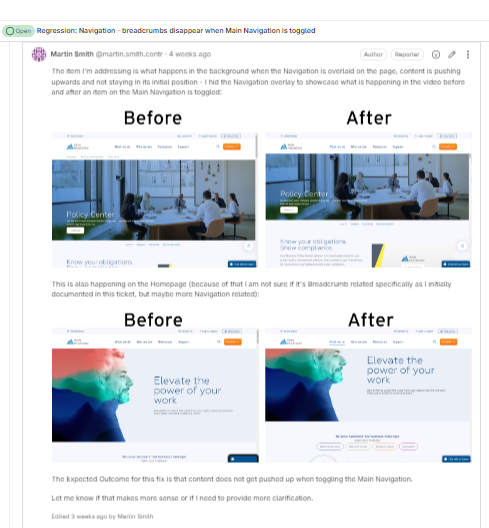
Highlight
In taking lead on communicating design changes to development, I helped reduced the number of open tickets from 350 to 230 in a month’s time span.
Final Product
A Reimagined Content Experience Come to Life

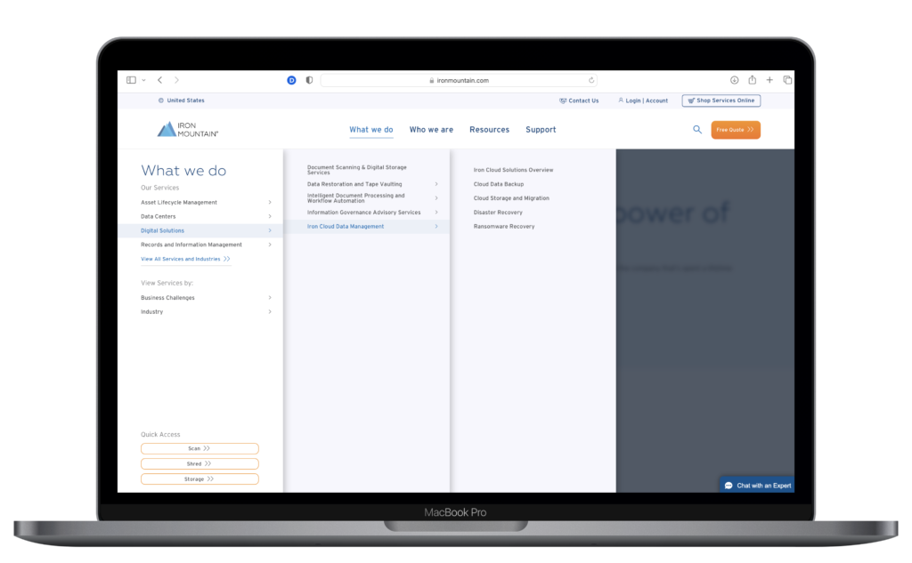
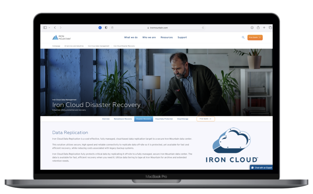
Clearer focal points for Iron Mountain’s content.
With a more minimalistic approach to the site’s visual design and simplified site structure, website content for Iron Mountain became more visible and accessible. This lets customers be able to focus and read through content without additional distractions.
Increased visibility and indication of user journey.
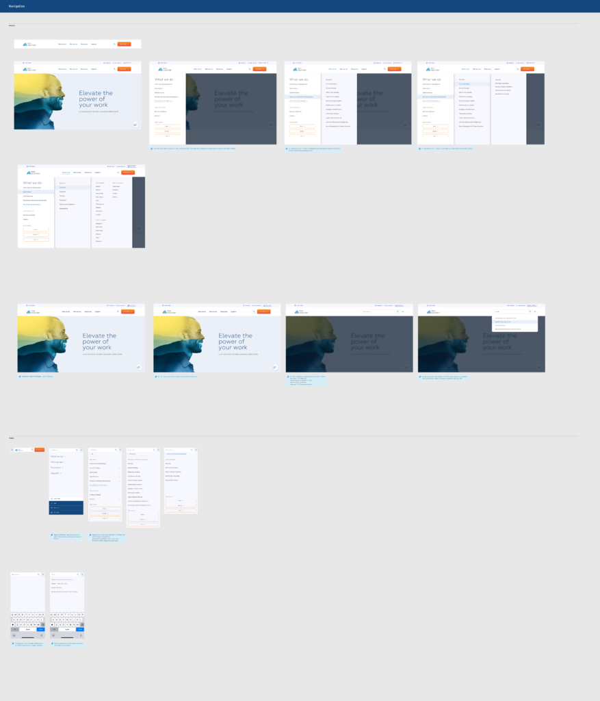
The reorganized Navigation structure and the introduction to a Breadcrumb navigation system allows for more visibility of what web pages are related to each other. Customers this way have a smoother experience in navigating and wayfinding across the site.
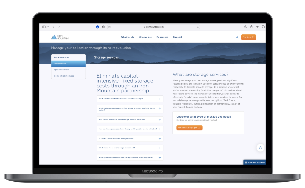
Versatility to create unique web pages to fit Iron Mountain’s content needs.
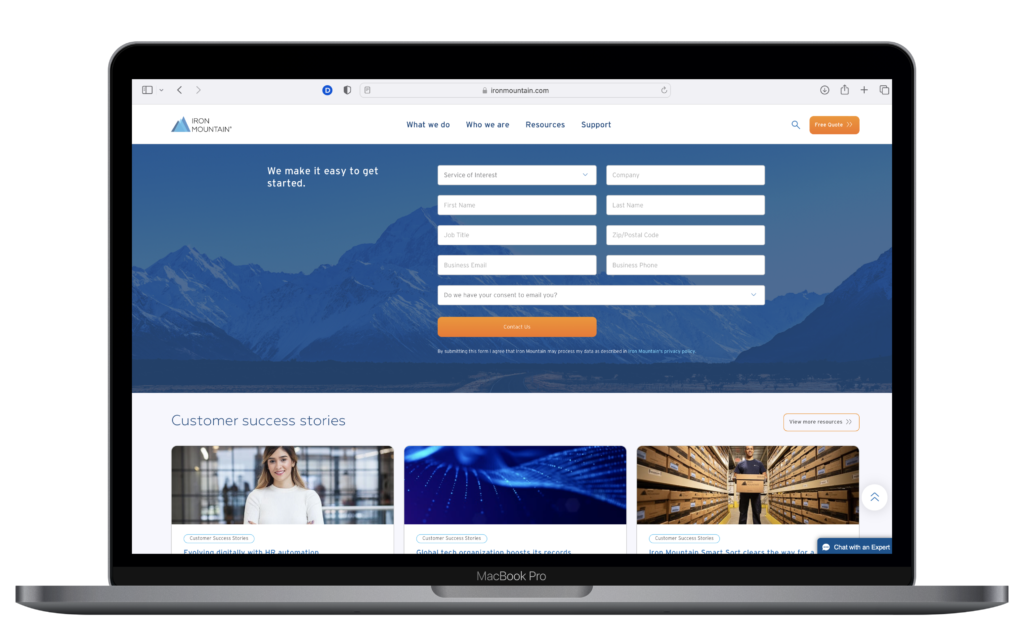
All designed web components and layout options helped enable the content entry team to tailor webpages based on content needs in a cohesive, non-repetitive, and unique way.

Results and Outcomes
Increased visibility of marketing pages that did not have as high exposure beforehand.
Within a couple weeks after the initial US and Canada site launches, marketing stakeholders were reaching out about content changes/edits because of increased visibility to services that Iron Mountain offers. Sales leads also increased after one month after launch.
Ease in use of localizing content across different countries and regions.
The digital marketing and content entry teams both had positive remarks about creating, maintaining, and updating content with the new components in the content management service. Overall comments discussed the ease of use and reduced workload when maintaining pages across regions.
What I Learned
Working Hard to Become a Better Leader
It is important to show up ready and prepared for work each day.
As this project was fully remote, I still wanted to make sure I was bringing my best to work each day. Whether it meant being meticulous about photo selection, spacing, typography, colors, or general HTML/CSS basics, I wanted to bring my A-game in terms of effort. My team recognized this, and crafted this really awesome word-cloud describing my work ethic for my last day.

Prioritize the important design changes.
From working directly with developers in helping implement design changes, I had to recognize and understand that not all design changes could happen overnight. Even though design feedback was coming from all over both internally and externally during the first few development sprints, I realized that organizing design feedback by severity was necessary to focus on more important asks while not getting engineers sidetracked with smaller issues.
Taking a stance on design decisions and communicating effieciently is essential in a fast-paced environment.
As a consultant for Iron Mountain, I quickly had to realize that my team was valuing my input and eye for design. Rather than putting energy into analyzing and detailing every pro and con of certain design decisions, I had to make quick and impactful statements on what designs would work for Iron Mountain and why. This ranged from feedback across various spectrums of design, including functionality, feasibility, and general visual consistency.
