Overview
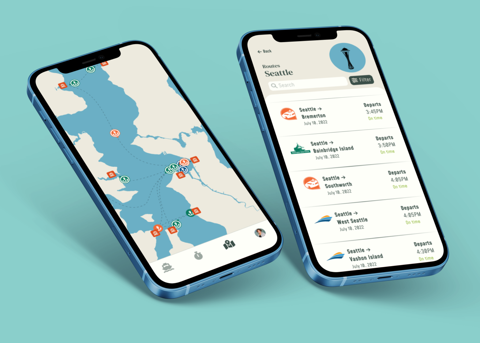
Mobile application design developed for ferry riders in the Seattle region to standardize scheduling, increase visibility of schedule changes, track ferries in real time, and lower the point of entry for new riders.
Timeline: July 2022 – August 2022 (6 weeks)
Team: Designer x 1
Role: UX Designer, UX Researcher
Skills: Desk Research, User Interviews, Prototyping (low-fi & high-fi), Illustrating, UI Design, UX Writing
Background
Washington State has the largest ferry system in the United States, with Washington State Ferries operating 21 ferries around the Puget Sound region as of 2022. With the population growth that the Seattle metropolitan area has experienced within the past 10 years and Seattle being one of the fastest growing cities in the country, the state has looked to improve its public transit services to match the region’s growth. For ferries, this has included renovations of aging ferry terminals and increasing passenger-only ferry service across the region by 2050 at the latest.

Problem
The unpredictability of schedules, weather, limited vessels, long waits, and cancellations have strained how people perceive ferries, which has become a concern for Kitsap County and King County’s Vashon Island whose economies depend on consistent ferry service.
Since the introductions of passenger-only ferries across the Seattle region through the King County Water Taxi and Kitsap Fast Ferries however, residents of Kitsap and King County alike have quickly gained appreciation of these ferries for convenience, avoiding traffic, and providing easy access to Seattle as well as other towns and cities along the Puget Sound. This in result has increased demand for ferry service around the region.
As ferry transit around Seattle continues to improve and expand to meet the goal of their 2050 plan, reducing the negative perception of ferries and the unpredictability of ferry scheduling is key for the following:
Strengthening the relationship between ferries and the communities they serve
Growing the number of ferry riders and commuters across the Puget Sound
Gaining sustainable funds that can help ferries improve service and increase access to and from Seattle
Retaining and increasing the number of maritime workers who run the ferries
Building interest within the public and private sectors for the continued investment and innovation of Washington State’s ferry and maritime services
Research
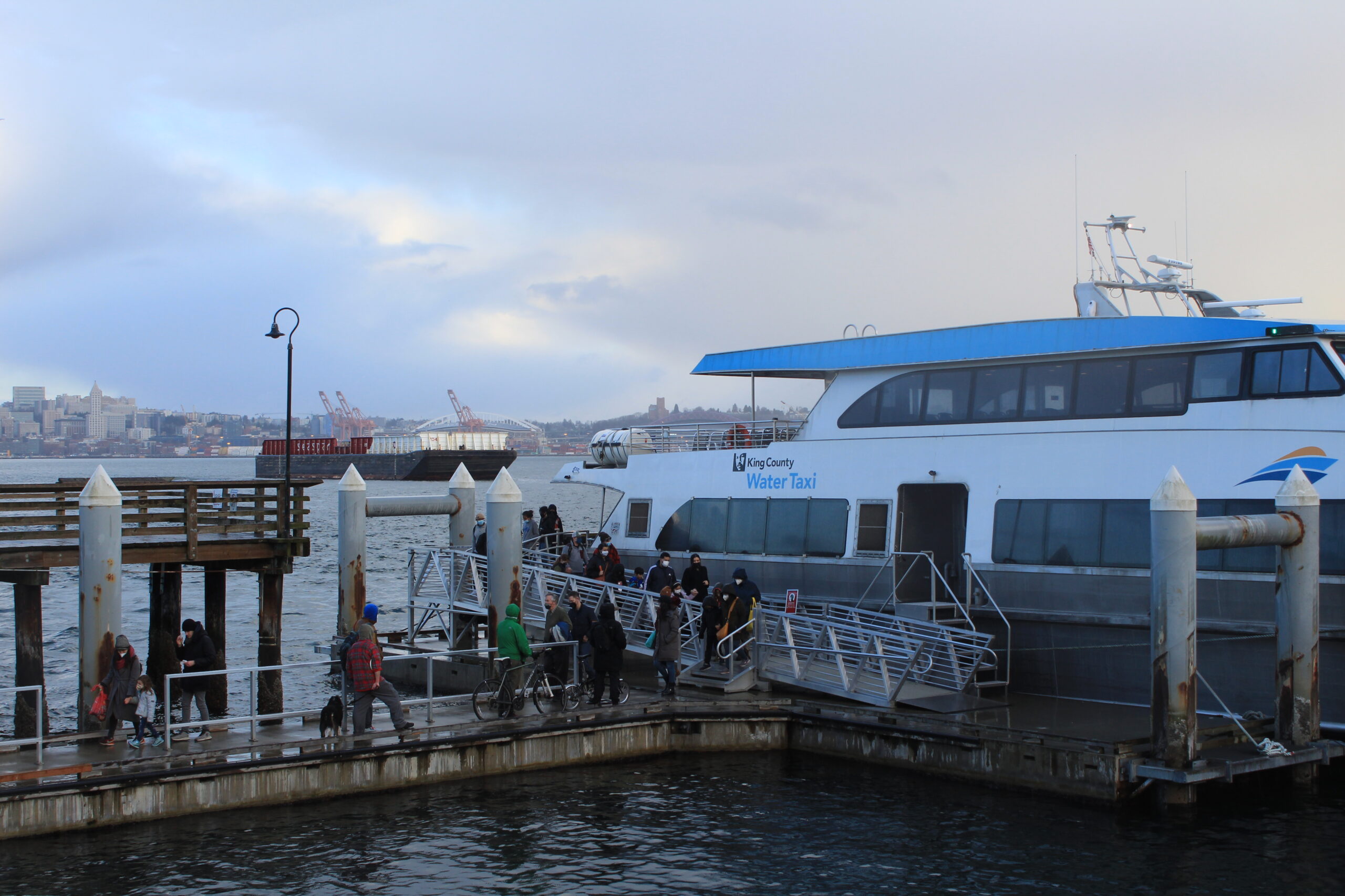
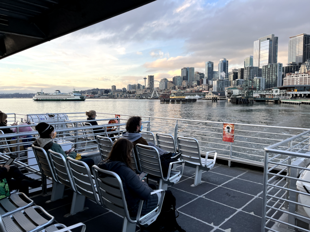
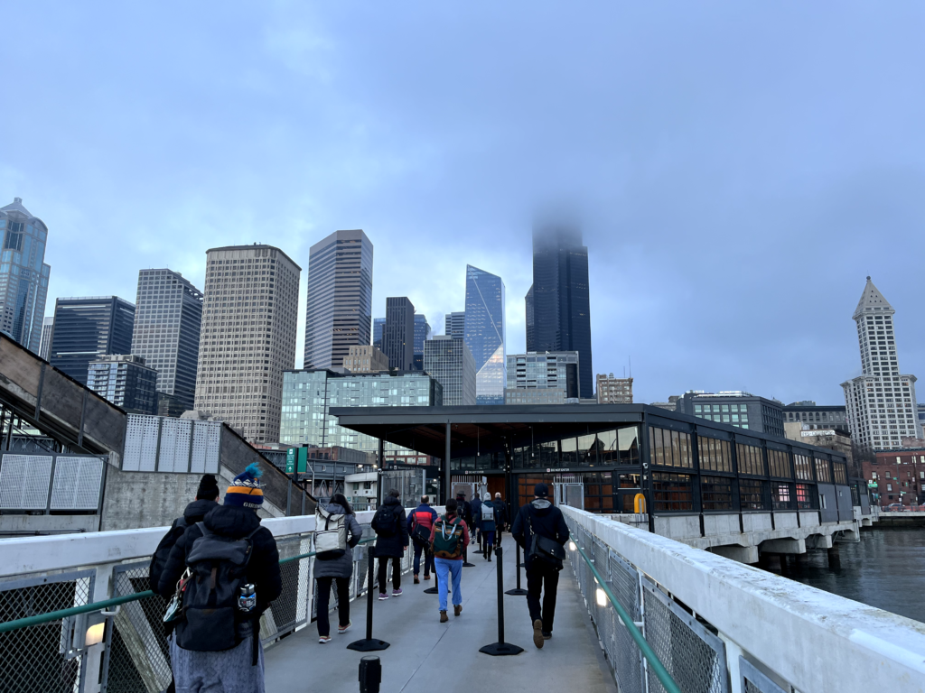
To kickoff the research process outside of desk research, I went to the West Seattle neighborhood and observed the early morning commutes that the King County Water Taxi would do with its route from the West Seattle terminal at Seacrest Park to the Downtown Seattle terminal at Colman Pier.
There I intercepted 2-3 passengers and asked them about their experience planning, waiting, and general overall experience taking the ferry.

Findings
Commuters were aware of the ferry schedule well before arrival/boarding
From taking the bus shuttles to biking or walking, commuters showed up like clockwork around the ferry schedule. Most commuters that I talked with also indicated they had looked up the ferry schedule before arriving at the terminal.
Waiting caused the biggest painpoint for commuters
A couple early morning commuters that I interviewed said they waited in their cars to avoid the cold, and another commuter made a comment about how it would have been nice if there was a coffee stand at the West Seattle terminal so they could buy and enjoy some caffeine before boarding the ferry.
Ideation
Noticing the bottleneck between knowing the ferry schedule and the unknowns on when the ferry actually arrives while waiting, I wanted to iterate my designs behind how the ferry schedules could be better communicated so commuters can:
Regain control of personal schedules
Spend less time having to wait for the ferry
Reduce stress that is indirectly involved with catching/missing the ferry
Considering physical limitations and how participants coordinated and scheduled their commutes, my main concern was whether the design should be a physical or digital solution.
In my immediate observations, the physical spaces were not created equally, as seen through the Downtown Seattle terminal (Colman Dock) and the West Seattle terminal (Seacrest Park).
Downtown Seattle (Colman Dock)

- Serves 6 routes
- Recent renovations of terminal, can support both multimodal ferries and passenger-only ferries.
- Developed infrastructure to support waiting, which includes protection from weather elements
- Electronic monitors showing schedules and when the next ferry departure is – updates with each departure.
- Lots of lighting – ideal for nighttime conditions
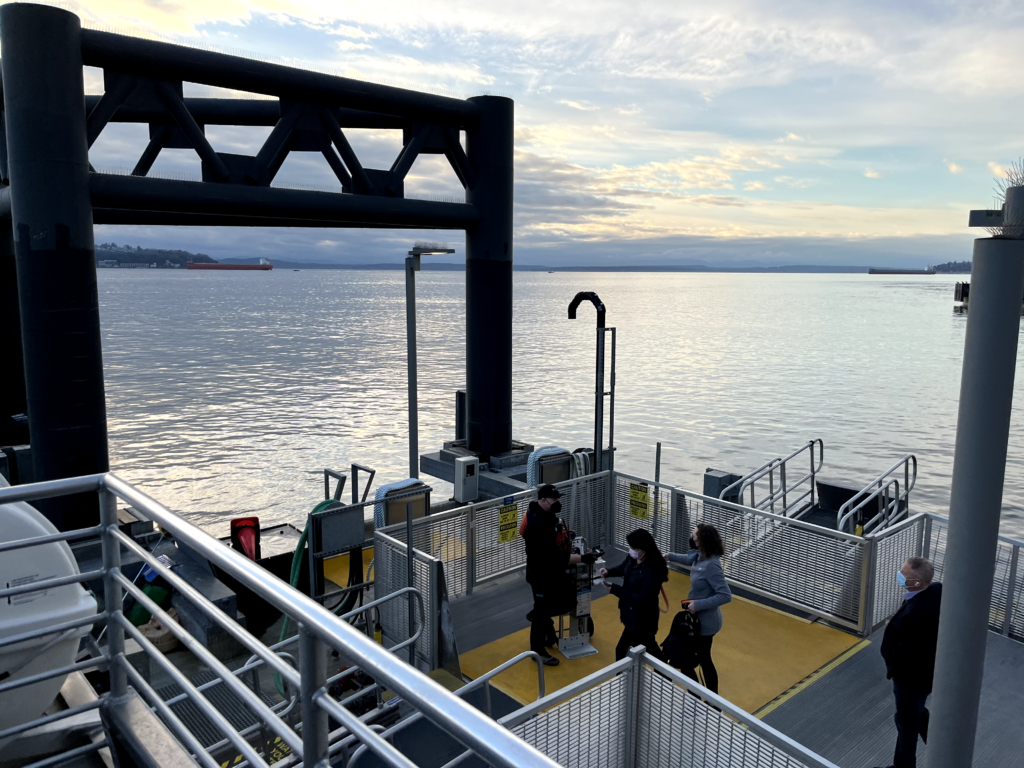
West Seattle (Seacrest Park)
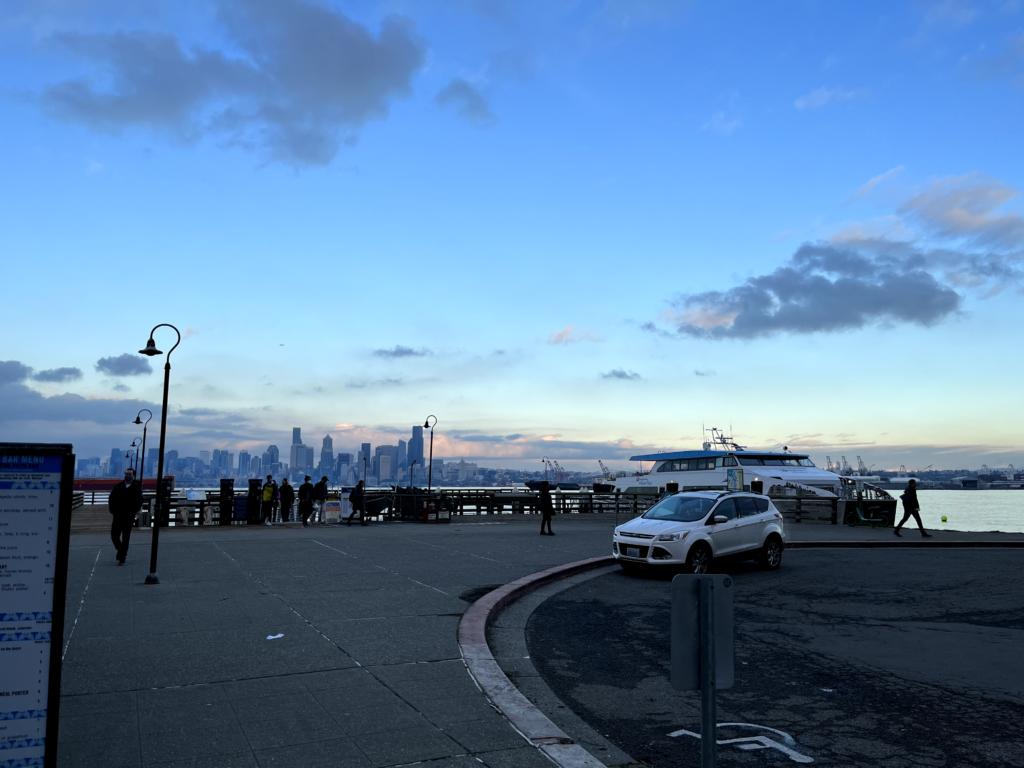
- Serves 1 route
- Floating dock, can only support passenger-only ferries
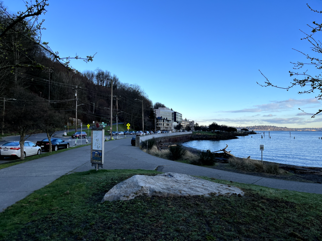
- Dock built outside a park and utilizes their facilities, but currently lacks infrastructure to support waiting commuters from the weather (i.e. rain, cold, heat)
- Physical a-frames displaying printed schedule of departure and arrival times – doesn’t update
- Lack of adequate lighting – very dark in nighttime conditions
Taking funding into consideration and that the downtown Seattle ferry terminal deals with much larger ferry traffic than West Seattle, accommodating for a physical design solution seemed too niche for ideation and not as practical considering each ferry terminal differs in resources, number of routes, and the amount of riders they service.
With this conclusion, a digital solution felt the most appropriate and feasible, as this:
Reaches a larger target audience and is scalable
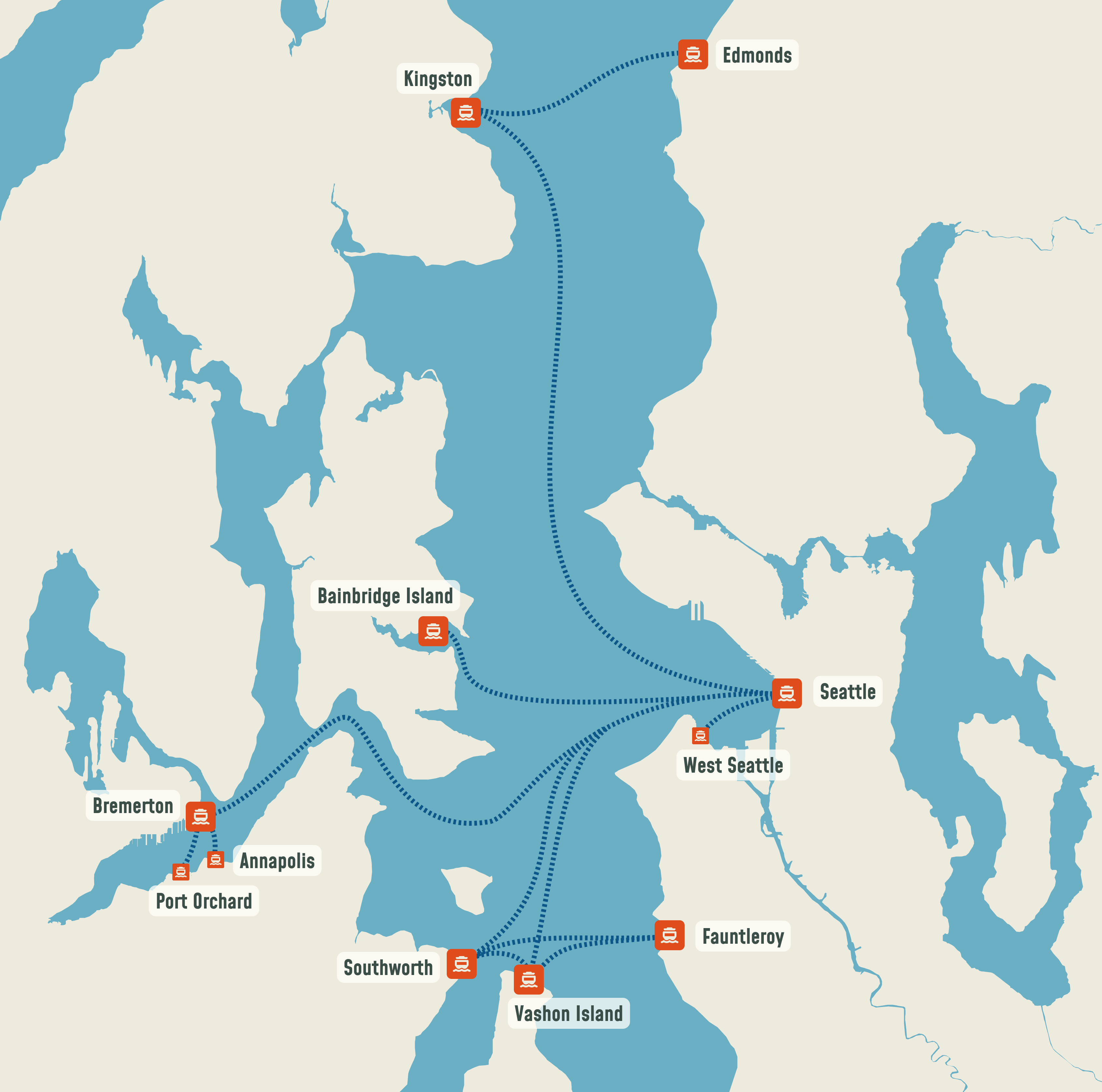
There are currently 11 different communities receiving ferry service around the Seattle region and potentially more as future passenger-only ferry routes are being considered for Tacoma, Lake Washington, and Shilshole Bay. To meet this expectation for expansion, this design has to be relevant to ensure the target user base encompasses as many current and potential commuters as possible.
Can work with all ferry organizations together versus individually.
Since the Seattle region is unique having three different organizations currently running ferries across the Puget Sound, having them work together towards a common goal felt more feasible in solution.



Design Principles
My primary goal for the design was to establish visibility for the scheduling of ferry sailings, with the long term outcome of creating a sense of consistency and reliability for those that use Washington’s ferries, regardless of familiarity with the service or schedule. From this I established the following design principles to follow.
Design for Visibility
Make schedules and route tracking more easy to see and access.
Design for Consistency
Make all ferry routes serviced feel more unified with provided scheduling information
Design for Reliability
Make ferry scheduling feel predictable with route departures and arrivals
Competitor Analysis
In conducting my competitor’s analysis, I broke down the analysis to figure out what digital solutions were available specifically to ferry transit within the Seattle region and other regions across the US.

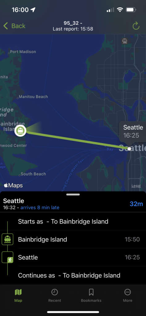
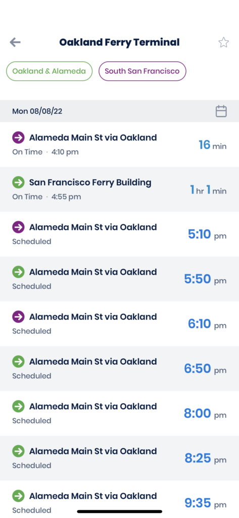

One of the quickest findings from my analysis was that there wasn’t a standardized application focusing on ferry transit, and especially one equipped for Seattle’s situation.
Popular mapping applications focused primarily on finding the fastest route to destination.
Observed real-time transit tracking applications for ferries in other cities only had to cover one service provider.
The majority of transit applications did not have real-time data on Seattle’s passenger-only ferries.
The opportunity for standardizing ferry scheduling become more apparent once I noticed that each of Seattle’s ferry organizations were taking their own approach with what transit information they supplied to commuters and how they went at it.
From this I decided to create a real-time tracking app specifically for all the Seattle region’s ferries, as it fills the need for a ferry transit application in the region, as well as that it would improve consistency with schedule interpretation when riding ferries across different organizations.
Prototyping the Information & Content
Using my competitor analysis findings, I devised the following features were essential to include into the prototype:
- A map displaying ferry terminals and vessels in real-time
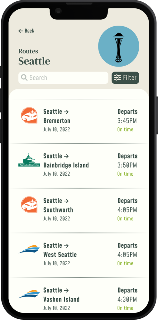
- A listing of all ferry routes, their next departure, and whether the ferry will arrive early/on-time/late
- The full schedule listing all sailings for a specific day
- Highlighting and tracking one specific ferry on their route
With this, I then defined a rough user flow to define the necessary information architecture of ferry transit information, as seen below:

Creating Map Components
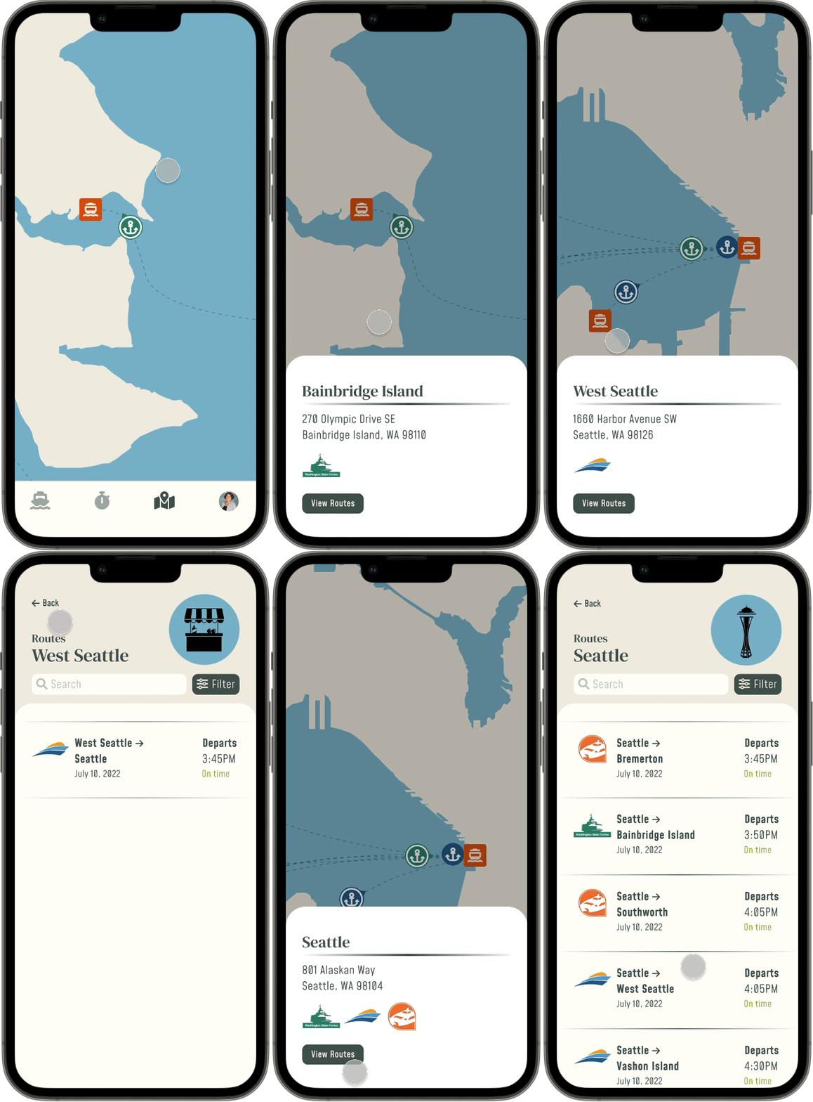
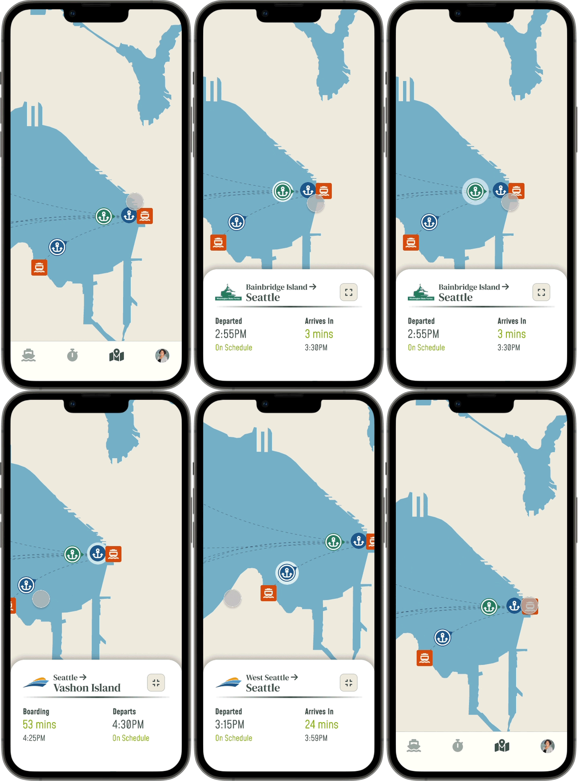
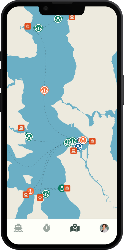
To distinguish vessels of different ferry organizations from each other on the map, I used the primary color of each ferry organization’s branding in their vessel icon. As to indicate the vessel’s state, I made variations of the vessel icon to showcase whether the vessel was docked or sailing, and in which direction.
Ferry terminals were also defined with a different shape and icon so they would not be confused with the vessel icons.







To distinguish ferry terminal locations from each other, visual branding was also introduced to help improve commuter recall when identifying which is their target destination – as well as introducing a potential for introducing wayfinding efforts of identifying terminals within their physical spaces. For inspiration I referenced Sound Transit‘s iconography used at its Link light rail stations.









Final Mockups
Viewing Terminal Information
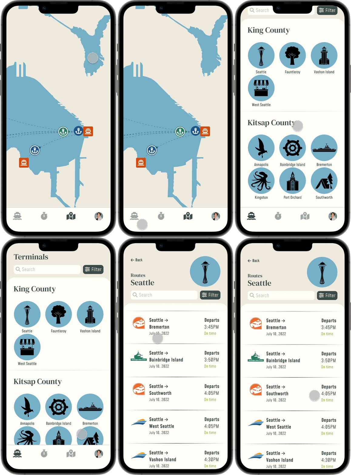
Can quickly view terminal information. On the map, this includes viewing the address and ferry services operating from the terminal. Accessing the terminal leads to a list view of the routes available from that terminal.
Outside the map view, I also established a more list-oriented view categorized by county, where each terminal is identifiable by a unique icon. This way the user can navigate quicker to find their terminal of interest.
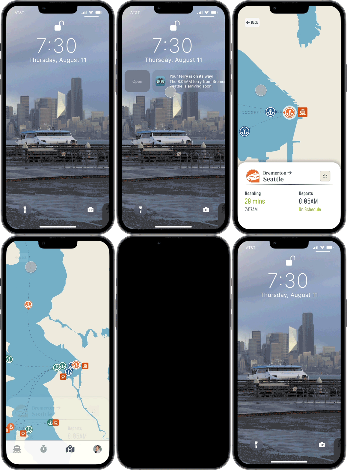
Tracking a Vessel
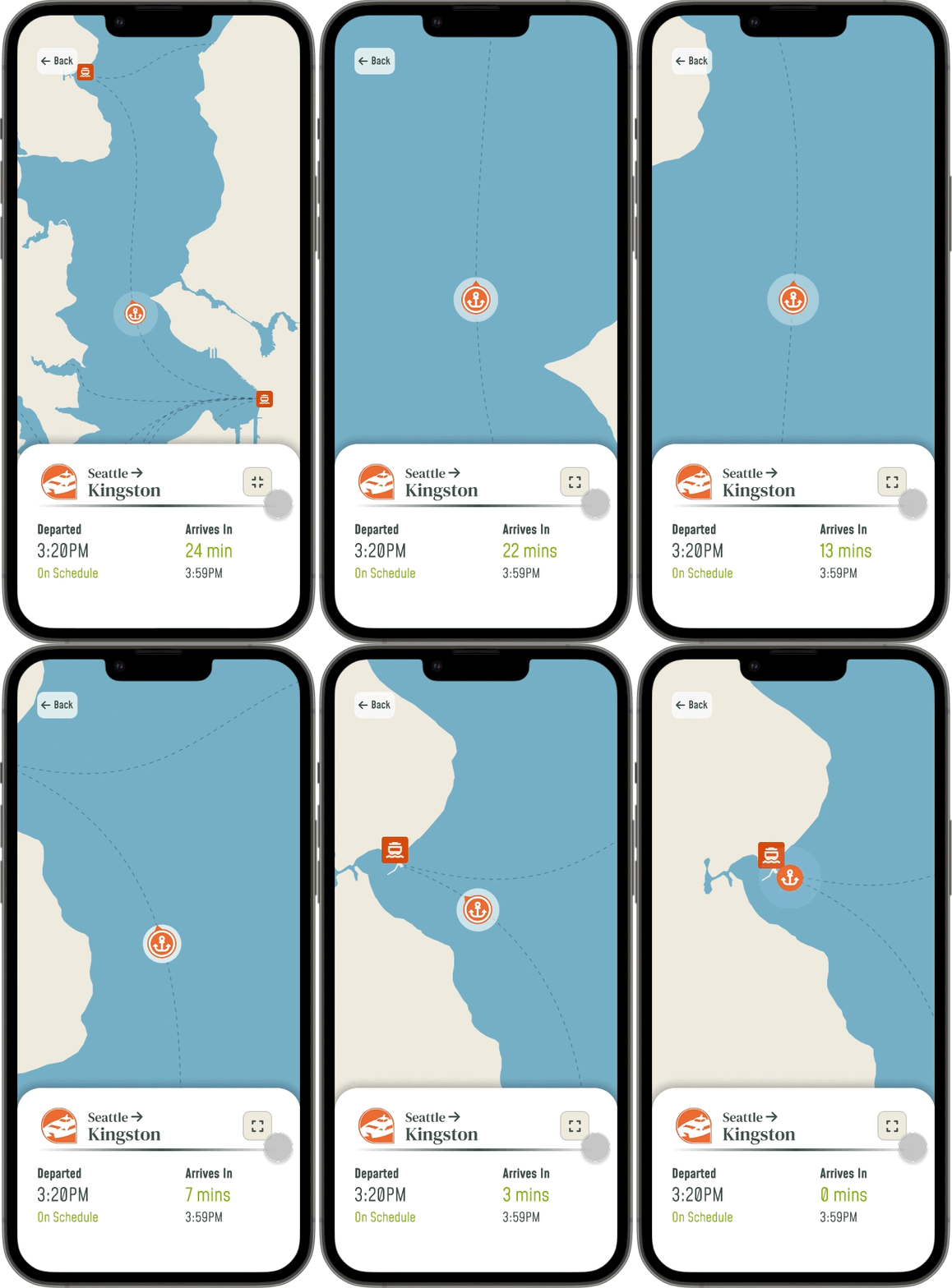
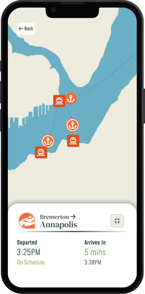
On the map a designated vessel can be centered on, highlighted, and tracked, while providing quick details about the current route the ferry is or will be servicing. The information about the vessel and its sailing include:
- Departure and arrival destinations
- Time of Scheduled or Actual Departure
- Remaining time left to board or remaining time until arriving at the destination
Viewing Route Information
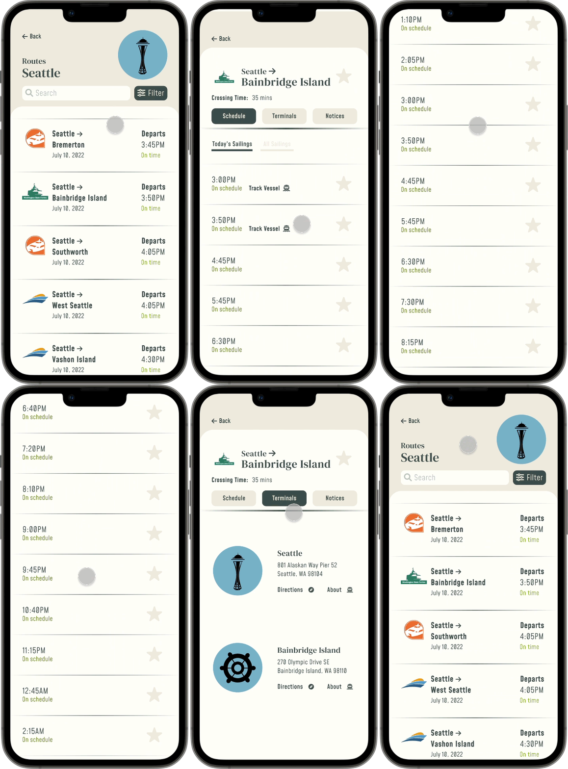
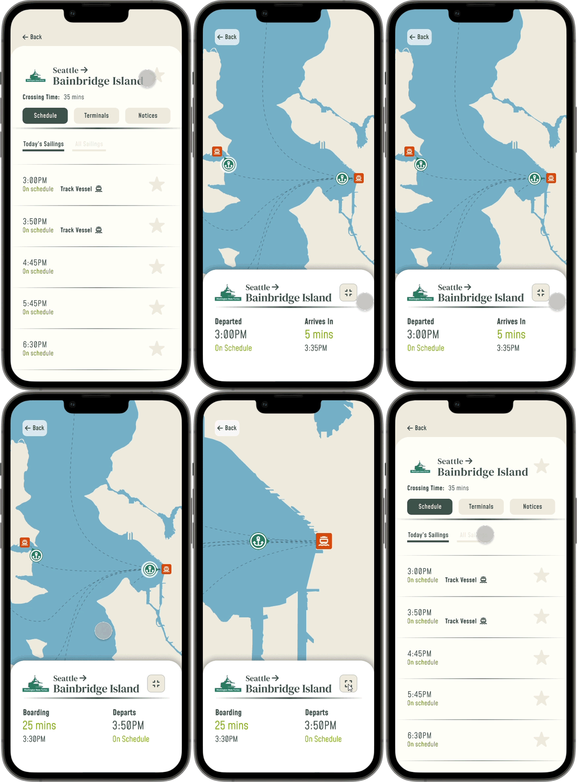
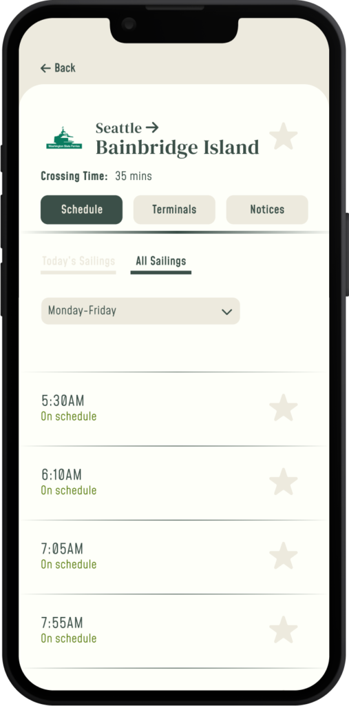
These screens display detailed information pertaining to a specific route, such as:
- Total crossing time
- Remaining sailing schedule for the current day and their estimated time to departure
- The scheduled times for all sailings on the route based on the day
- Terminal descriptions, and access to directions and more information
From this screen the upcoming or current sailing(s) can be tracked within the map. This is based on the number of vessels running upon the route.
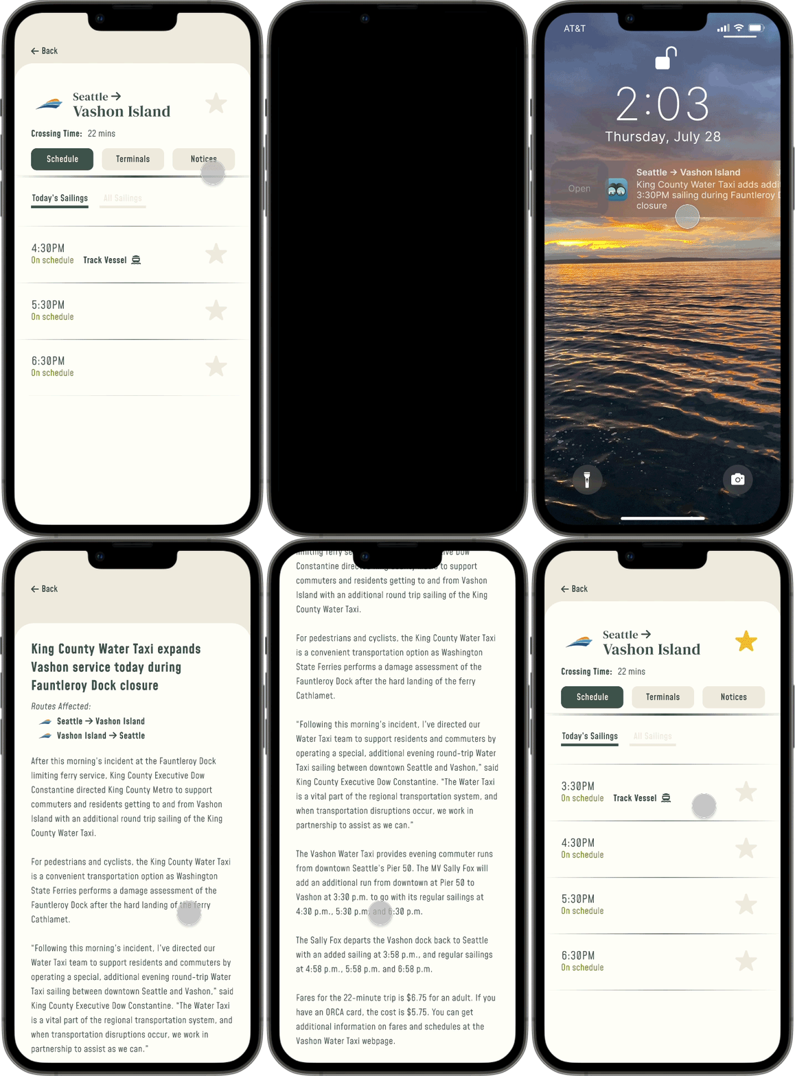
Receiving and Viewing Notifications
After favoriting a route or a specific sailing, a user can receive notifications about any reminders, updates, or changes to the route’s sailings. These notifications can range from a low to high level of urgency depending on the impact on the user’s commute and personal preference.
The low urgency notification example reminds the user that their ferry is arriving soon, while the mid-high urgency example alerts that an additional sailing has been added for their route.
Next Steps
User Testing
Conducting interviews and tests in-person with commuters at high-traffic ferry terminals will allow to see whether the design is matching commuters’ mental models.
Determine Primary Investor
Since this design would encompass many stakeholders (cities, ferry organizations, governments, etc.), identifying which ones have the biggest stake is essential to determine how the app’s design and development can be funded and take place.
What I Learned
Remembering that I do not need to reinvent the wheel.
As I researched mobile transit applications for ferries, I began noticing repeats in design patterns – especially with ferry systems utilizing Hornblower software (San Francisco Bay Ferry and NYC Ferry both run on this software). By understanding, leveraging, and building upon current patterns, I felt more confident in using my own research and design capabilities to conceptualize and innovate on essential features specific to Seattle’s public ferries.
