

Overview
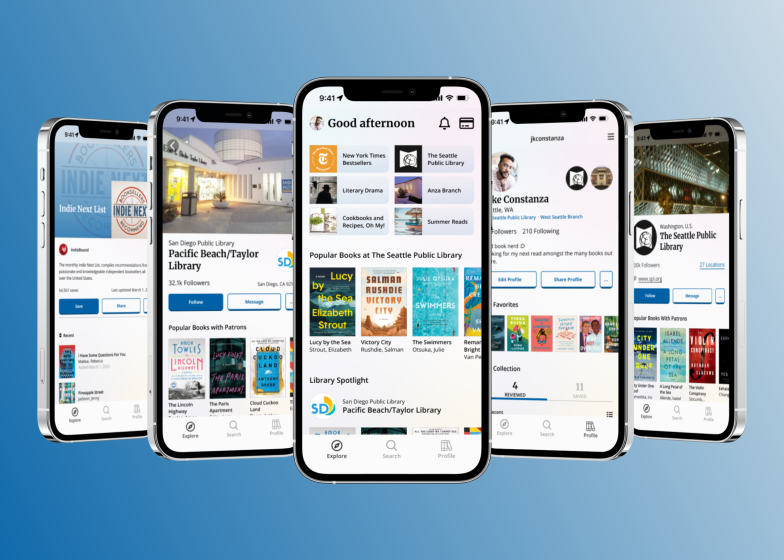
Biblio is a mobile application design that allows public library users to access recommendations and connect with other library users.
Outcome
Organizing and articulating multiple design rationales in an organized, methodical, and effective way.
Timeline: March 2023 – April 2023 (6 weeks)
Team: Designer x 1
Role: UX Designer, UX Researcher
Skills: Desk Research, User Observations & Interviews, Heuristic Evaluations, Prototyping (low-fi & high-fi), UI Design
Background
Understanding the Shift to Digital
Public libraries have long been a valued and trusted component within the social fabric of their communities. Seen as a valuable asset, libraries have provided communities with amenities such as learning opportunities, meeting spaces, and access to digital technologies to name a few.
Since the first COVID-19 lockdown, the shift to digital has rapidly accelerated how society perceives what a “community” is. From social media platforms, to remote work, to digital communication channels, the “community” we choose to surround ourselves with has transcended beyond its physical definition.
Problem
Expanding Outside the Physical
With an already strong and established physical presence, it it important to wonder how public libraries can innovate and expand upon their communities digitally. When the first wave of COVID-19 spread across the United States, public libraries were hit hard as physical locations were closed off to the public. Borrowing activity dropped more than 50%, and many public libraries have since struggled rebounding back to pre-pandemic borrowing levels upon reopening.
Seeing this struggle on the public library ecosystem – especially in less populated areas – I wanted to figure out how libraries could use the digital space to better connect their patrons and communities with one another.
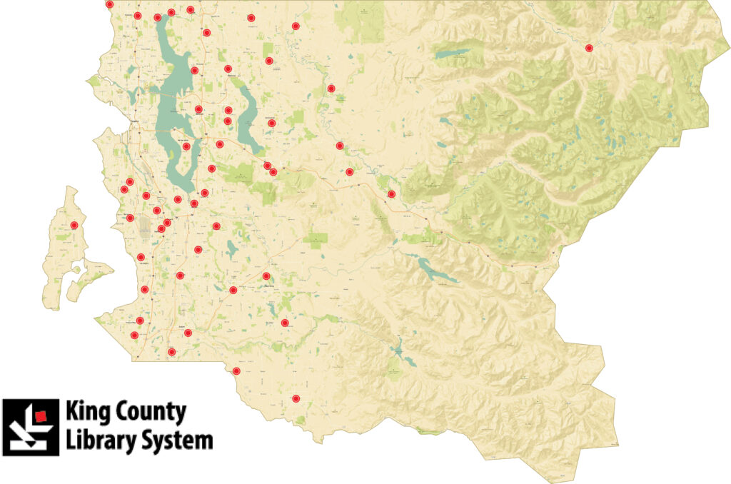
How might we encourage public library users to explore, engage, and grow their communities both within and beyond the physical branches?
Research
Understanding Current User Patterns
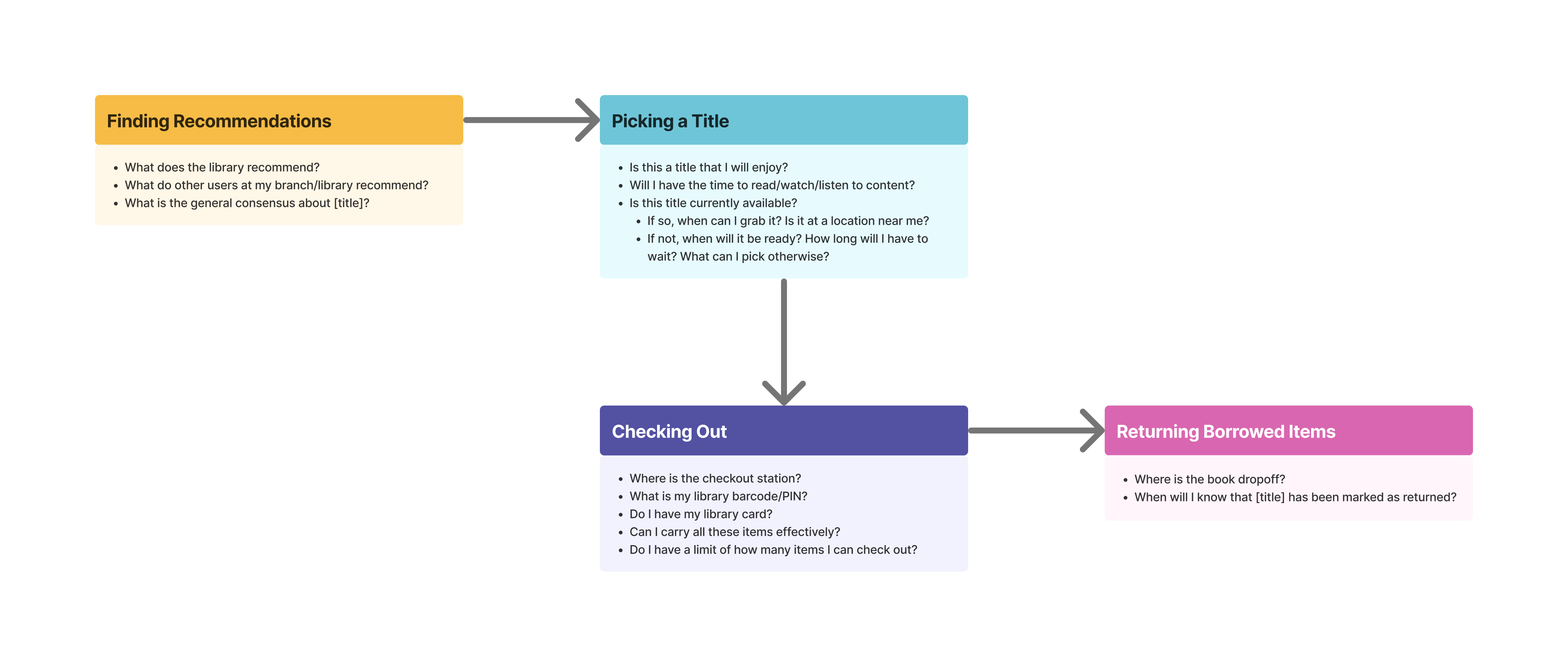
To quickly immerse myself in the public library space while avoiding scope creep, I started with trying to understand current digital methods in connecting others through a recreational book recommendation standpoint. Conducting an initial competitive analysis of the Goodreads book recommendation platform and discovery features provided to public libraries by the BiblioCommons platform, I was able to quickly define touchpoints throughout the user journey when looking to borrow a book.
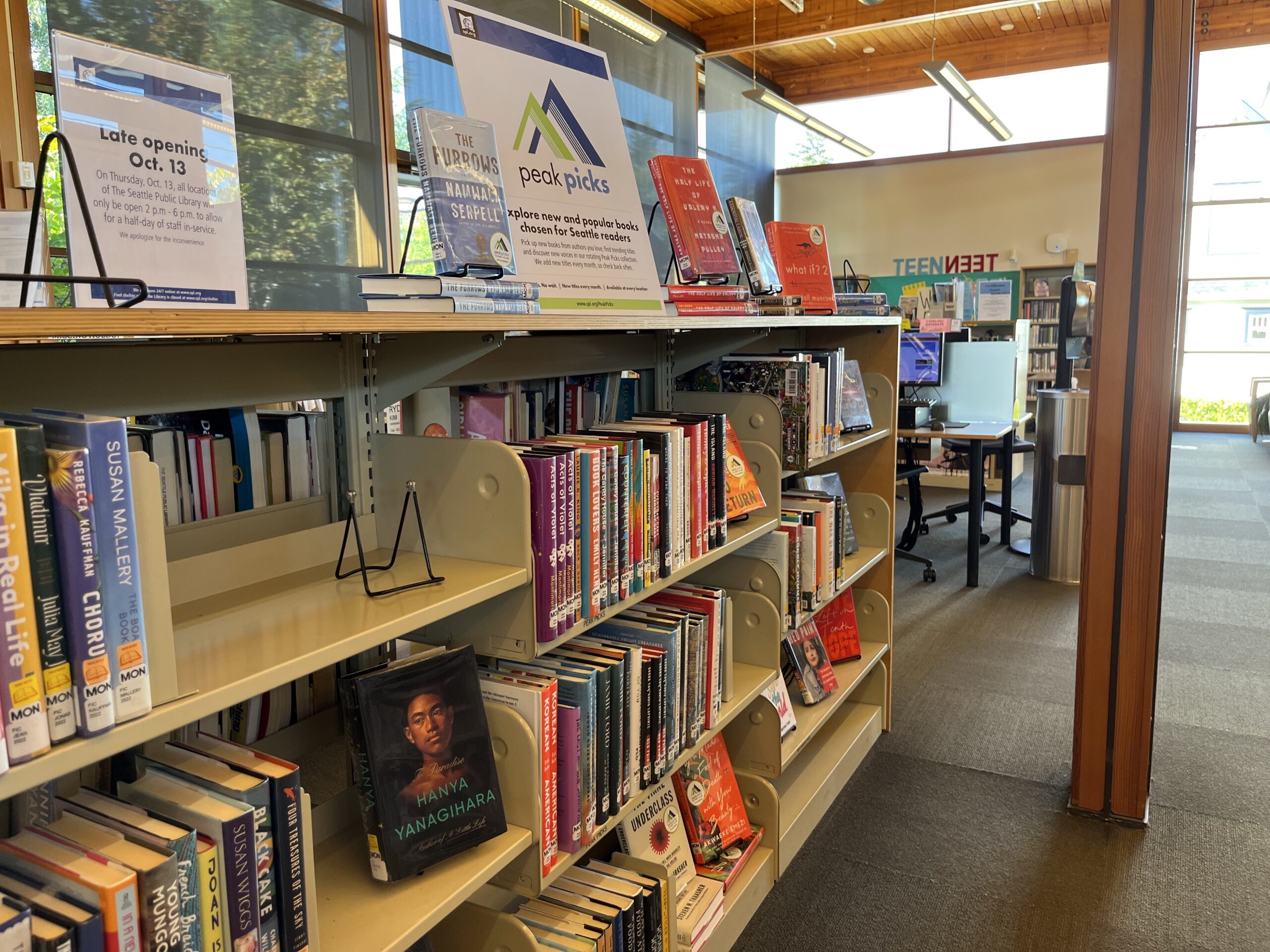
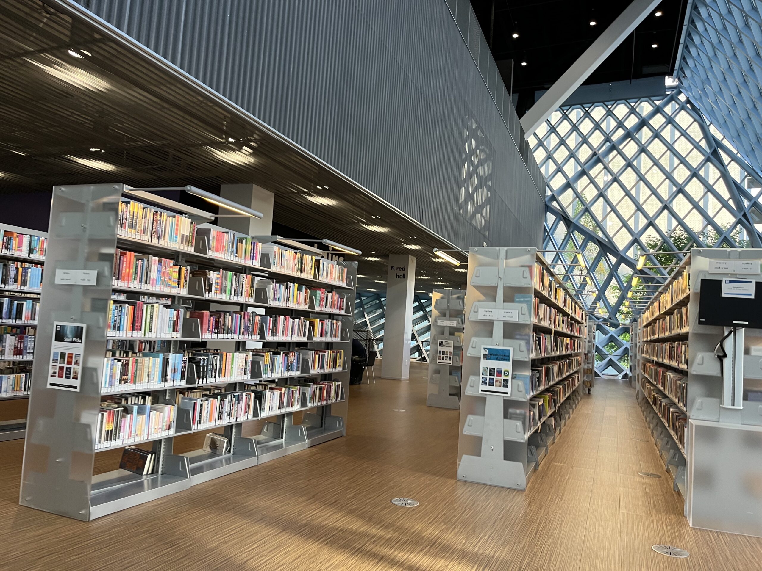

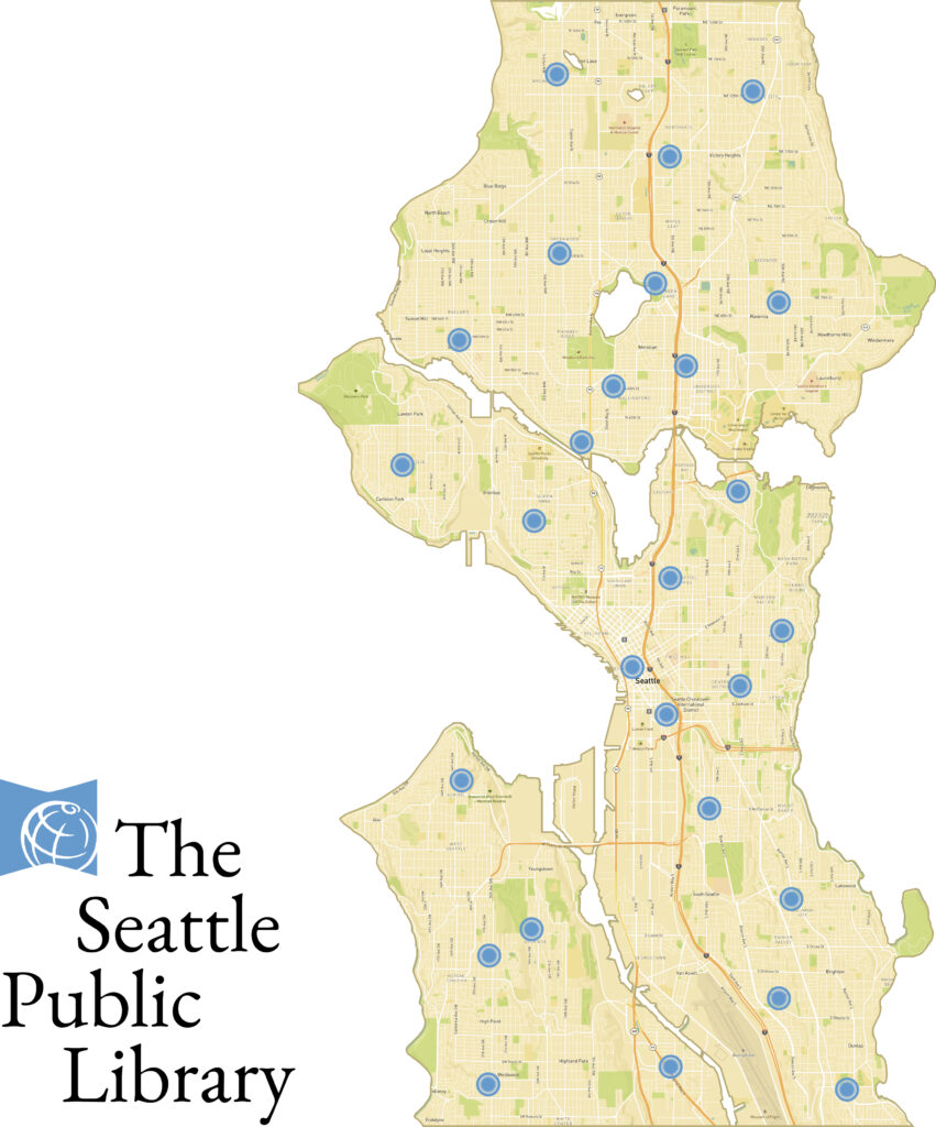
Furthering my research, I also conducted user observations at 8 separate branches at the Seattle Public Library. There I observed user activity and on occasion engaging with users asking:
- How long they have been a library card holder;
- What they used the library for;
- Why they use this library branch in particular;
- Whether they used or considered using another library branch (either in or outside their library system); and
- How their experience with this library branch differed from another one.
Initial Design Insights
The library was used primarily as a pickup destination.
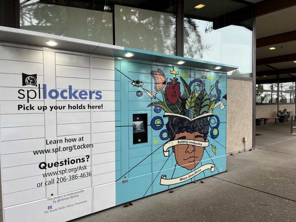
During my observations I noticed some users would beeline to the Holds area to pick up their books, and would head immediately to checkout. At some branches, they even had lockers literally set up outside their branches to simplify the pickup process.
The library recreational experience is still tied to its physical counterpart.
Outside of placing holds on books, the physical library resources that drove participants to the library were primarily community-center or third-place centric (recreational space, computer kiosks, restroom, WiFi access, outlets for charging phone, quiet space, and work desks).
Close proximity and easy access to the library is key to gain users’ trust.
Most users that I engaged with at Seattle Public Library indicated that they had been a library card holder for several years, and have built up strong rapport with the library’s services. For a majority of participants, they used a specific branch because they either worked or lived nearby the location.
Ideation
Defining the Personas

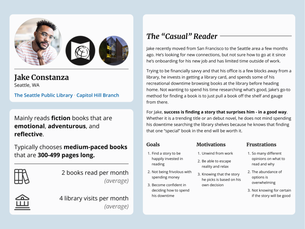
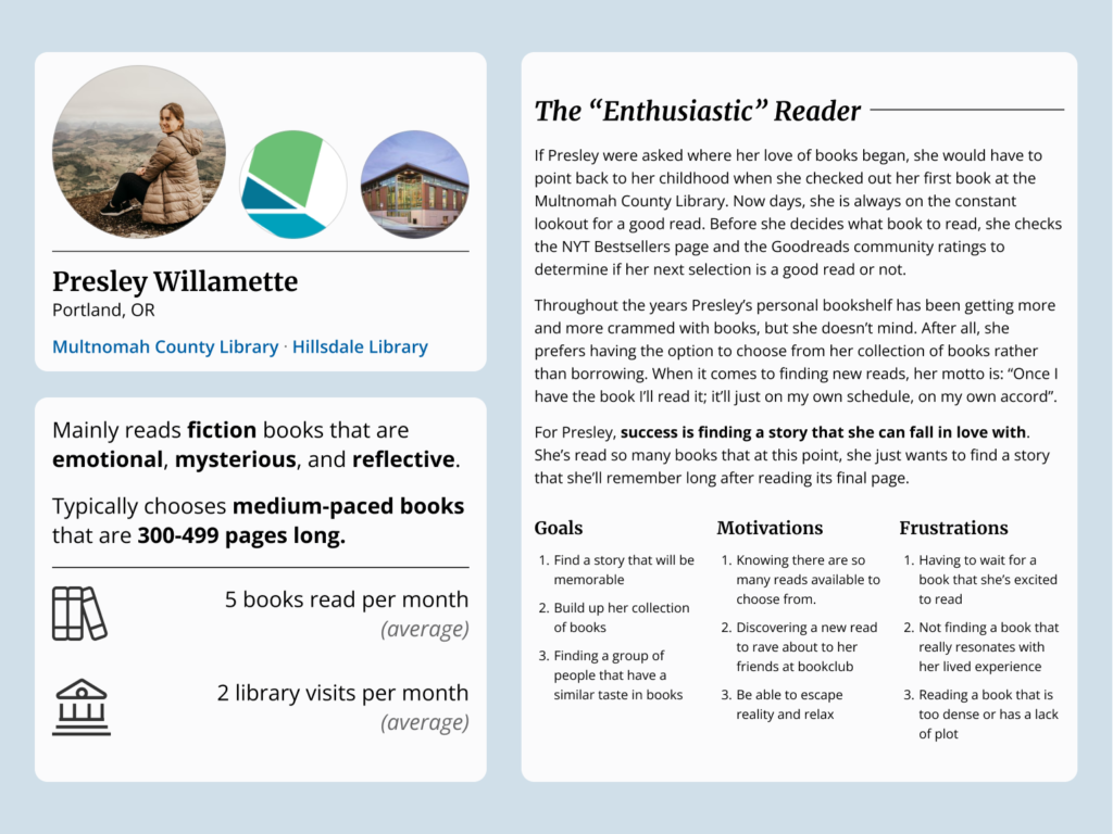
In my initial observations I noticed some users did their research beforehand by placing Holds, while other users would browse the popular/new section before selecting a book to borrow. Informed by this and to get my ideation process started, I created a “casual reader” persona and an “enthusiast reader” persona to focus what ideas would appropriately satisfy both types of users.
Design Principles
Based on the design problem and ensuring my solution were feasible, I established these desired design pillars to guide me on ideating features.
Design for Ease
Users will be able to explore book recommendations in a way that is simple, familiar, and straightforward.
Design for Engagement
The solution will generate interest for users and community members to interact and connect beyond their traditional library branch.
Design for Connection
Users will be able to view, explore, and interact with book recommendations from their libraries and/or other users.
Competitor Analysis
Looking for Pain Points in the Physical
Wanting to better understand the “enthusiast reader” and why they would purchase books instead of borrowing, I went to a bookstore and engaged in informal conversation with patrons asking about their reading habits and what would influence them to purchase or borrow a book.
The 3 participants I intercepted ranged from casual readers who were browsing to enthusiast readers who were looking for a specific book. Although having different reading habits, participants had similar experiences as why they preferred purchasing their books over borrowing.
1. Waiting to borrow a popular or desired item is not ideal.
“Why would I wait when I could buy it right now?”
-Participant 1
“All these people are reading [this book] right now, why would I wait until the hype ends?”
-Participant 2
2. The limited amount of time to borrow an item hinders the recreational experience.
“I rather have the chance to pull it off my own shelf, on my own schedule”
-Participant 1
“I sometimes forget about the book I borrowed, and the next thing I know is I have to return it without ever touching it.”
-Participant 2
3. The borrowed item is on the library’s schedule, not the patron’s.
“I would have liked to renew [book] and kept reading, but there was a long waitlist for [book] so I had to return it.”
-Participant 3
For participants, they indicated this increased stress or induced apathy to read their book(s) in a quick amount of time.
To further visualize the influences had upon the book recommendation space, I plotted a competitor’s analysis chart to learn and understand what roles other organizations and applications played in providing books for the “casual reader”.

Finding
No Sense of “Digital” Community For Public Libraries
From these insights from my competitor analysis, I realized that public libraries were being perceived as a lending service rather than a place to form and build connections. Wanting the design solution to be community-oriented and satisfy my design principles, I chose to pursue the challenge of designing a recommendation platform for public library patrons because the solution:
Improves the “physical community center” problem by giving public libraries a defined characteristic and a specific digital space where patrons can congregate outside the physical library, allowing for a competitive hybrid approach to build and strengthen communities.
Reduces the time users spend searching for local recommendations, which caters to both casual readers looking to borrow and more enthusiast readers that will commit to the purchase.
Uses a common thread between users, libraries, and organizations to quickly establish a layer of trust of what content is popular, or trending, or local, and so on.
Provides business and marketing opportunities for libraries and other organizations to further extend outreach efforts for their reviews and recommendations to audiences.
Prototyping
Creating a Proof of Concept
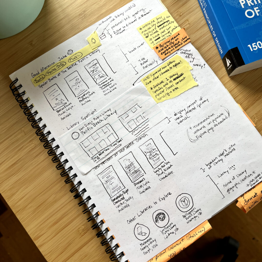
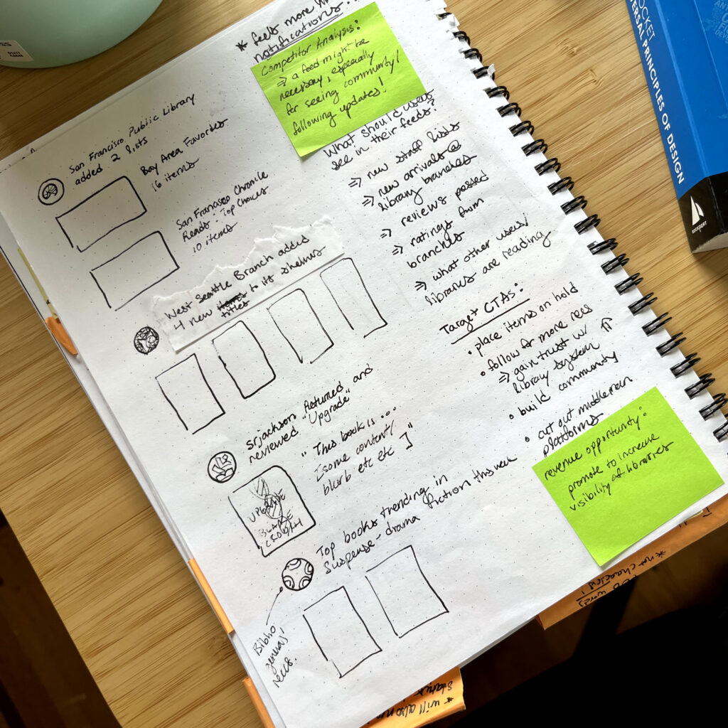
To effectively communicate my ideas, I started out low-fidelity with sketches to quickly showcase what features and layout could be ideated upon for the design.
User Flows
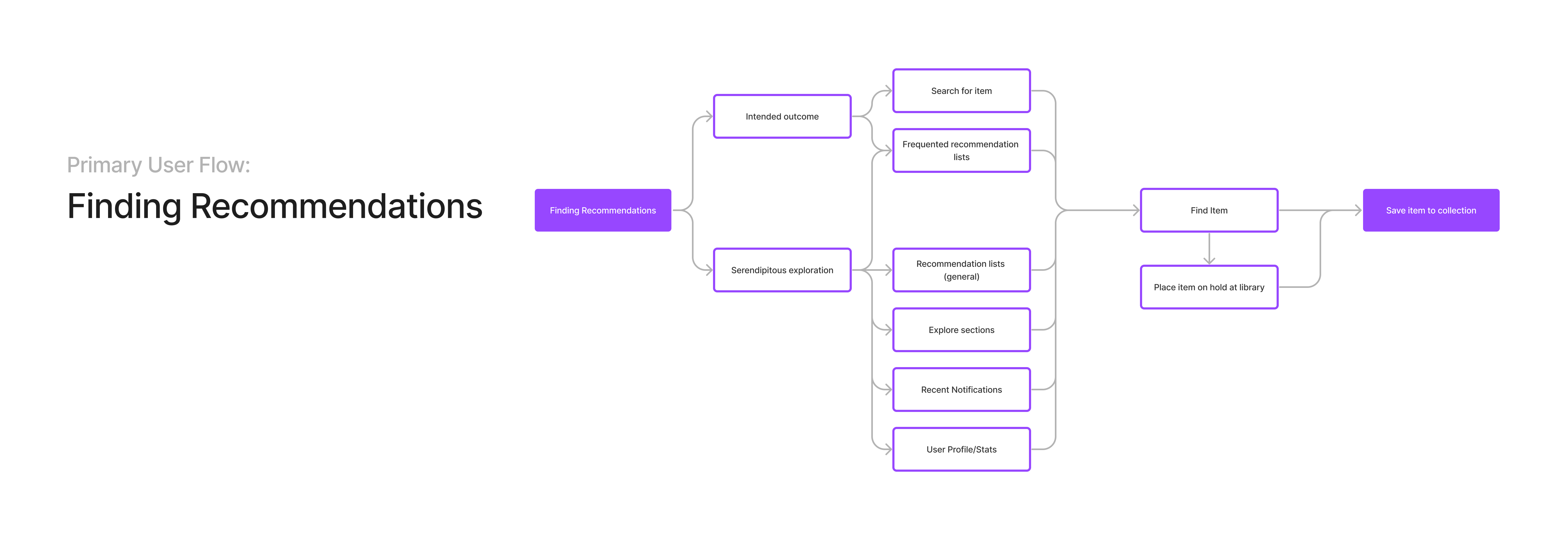
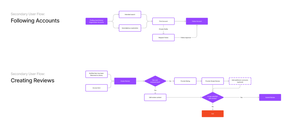
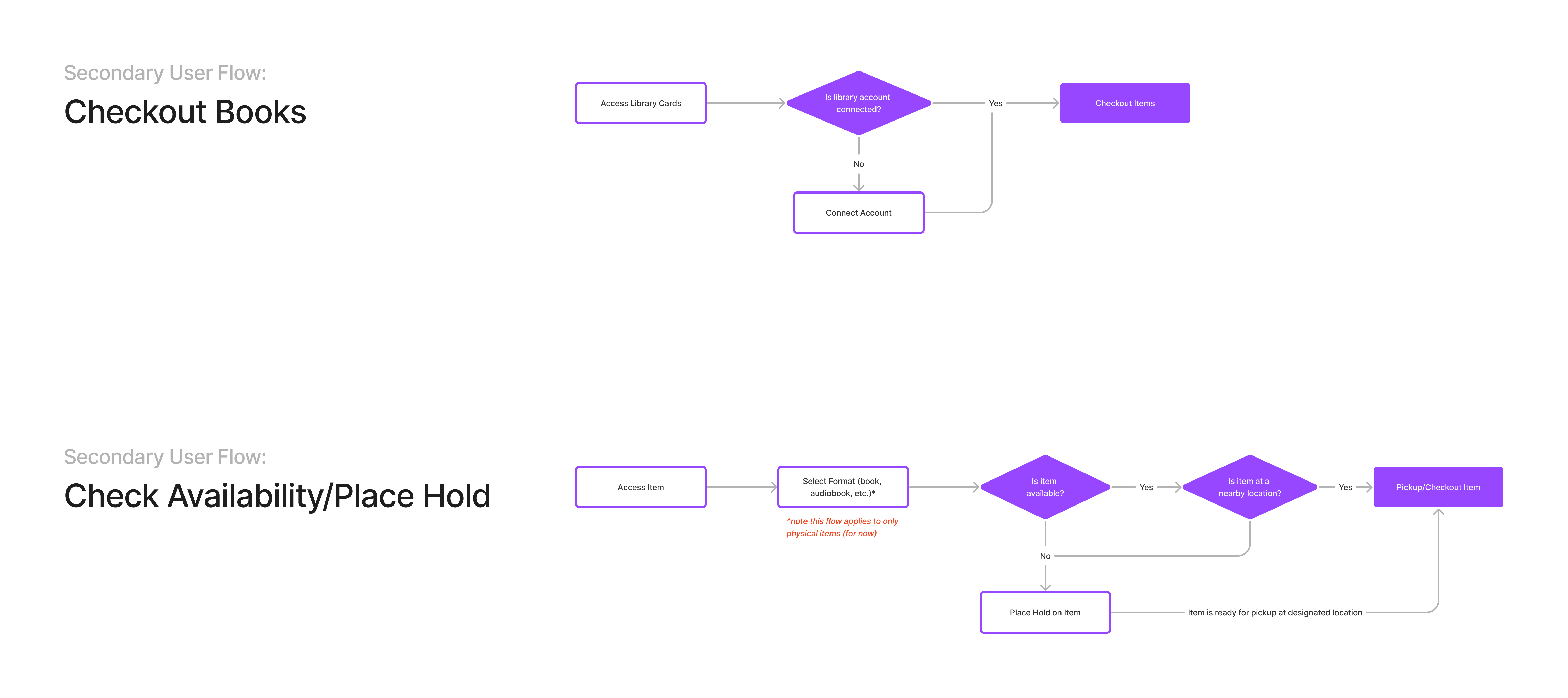
Keeping myself centered and grounded around my design principles, I immediately defined the primary user flow and secondary user flows that I considered necessary to keep the design feasible and focused.
Primary User Flow:
Browsing and Discovering Recommendations
Secondary User Flows:
Finding Friends, Creating Ratings/Reviews, Checkout Books, Placing Holds
Initial Concept and Testing

My first design iteration centered around highlighting and enhancing the public library browsing experience, from the initial search of finding a book all the way to returning said book. I reflected this in the Explore page displaying what was popular and available at desired locations, to the user profiles tracking borrowing activity and library profiles providing recommendations.
From this I then decided to do some user testing to see if my design was heading in the right direction.
So was the design heading in the right direction? Not quite…
Key positives (+)
Library management features were received positively
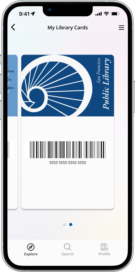
All participants highlighted how nice it was to have their Library Card included in a digital wallet, with one user commenting how that would help if they ever lost their library card.
Correlation to engaging with public library communities was clear
All participants immediately recognized upon first glance that the design engaged within the public library space.
Key critiques (-)
The overall design was seen more as a suite of library management features
Although encompassing a majority of the secondary user flows, most participants stated in reflection that the library management features were what primarily stood out to them.
The purpose for having a user profile could have been clearer in execution
A couple participants were confused about the user profile displaying borrowing activity, which I then would provide an explanation for its intended outcome of engaging and connecting with users.
From feedback, I realized I was so focused on making my ideas feasible for the journey of borrowing items from the library that the design diminished the primary goal of browsing recommendations. With this I went back to the drawing board to see where the design could improve.
Reiterating
Improving the Proof of Concept

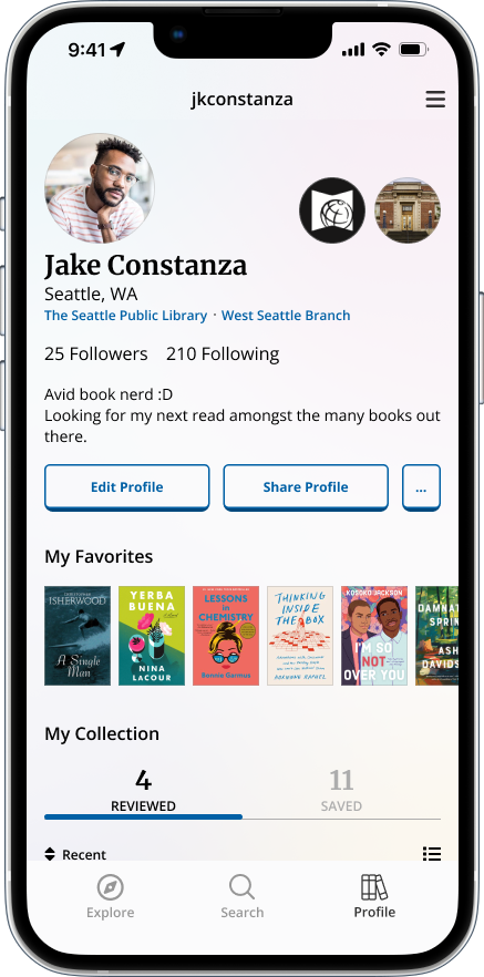
Restructuring the User Profile to Focus on People, not Borrowing Activity
Thinking what and how people would personalize and share their profile, I decided to give the user more control over what they shared by removing the data showcasing the user’s personal library management activity.
The reiterated design now involves pinning a user’s top favorite items that have been read/listened to, while also displaying saved and reviewed items.
Resuming User Journey with Finding Recommendations
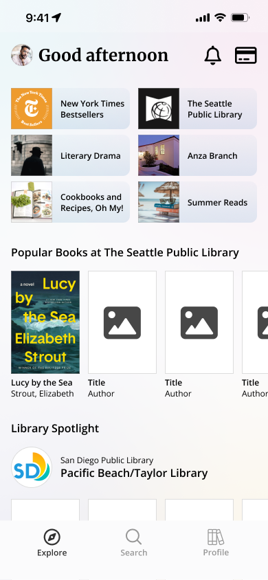
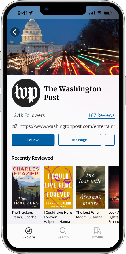
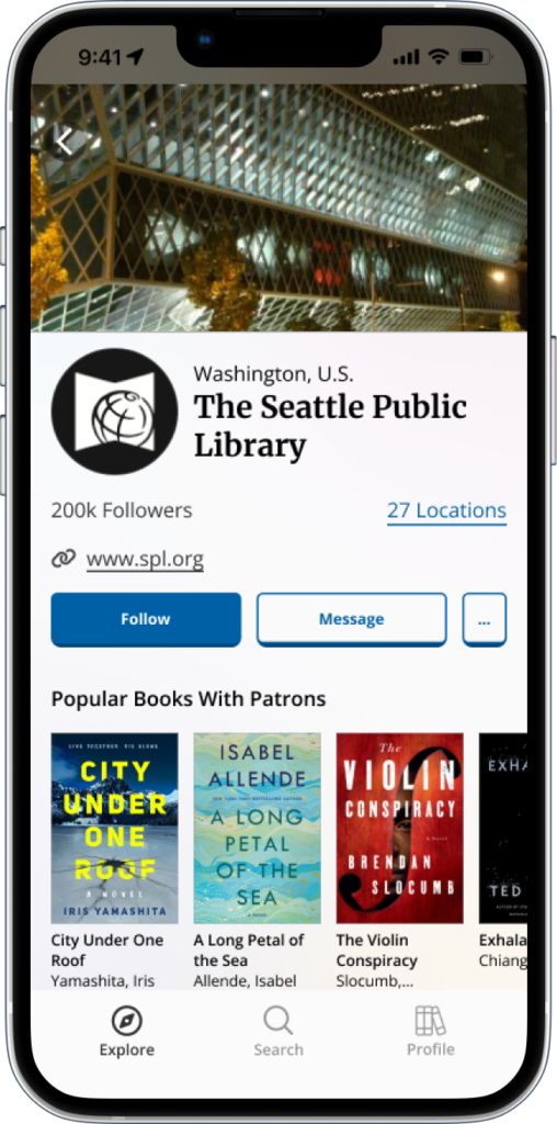
Instead of making a user restart their user journey to find new recommendations upon each entry of the app, I added a selection for recently accessed recommendation profiles (libraries, organizations, or general recommendation lists) on the Home/Landing page.
This allows for a quick recovery for users to resume what they were doing in search for recommendations if the user journey was previously interrupted or paused. It also strengthens the emphasis of the design’s primary user flow to browse and discover recommendations.
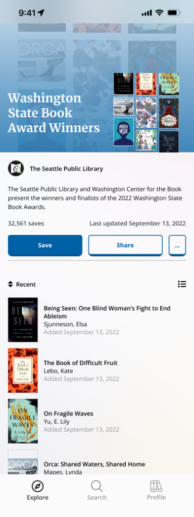
Constructing the Recommendation List Experience
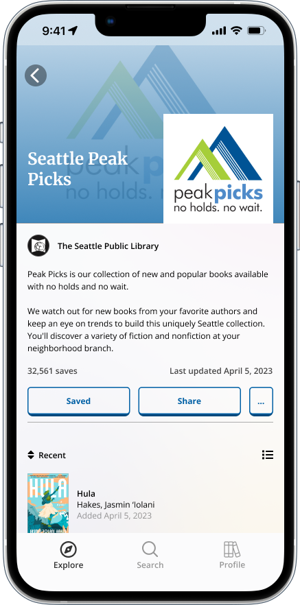
Realizing I was missing a critical component of showcasing recommendations in a curated way, I established recommendation lists (created by libraries, organizations, or other individuals) to access lists of recommendations outside of what is “popular”, “new”, or “trending”.
This method encourages my design principles for engagement and connection, as this provides a more personal and human element when users browse amongst these handpicked options.
Visuals and UI
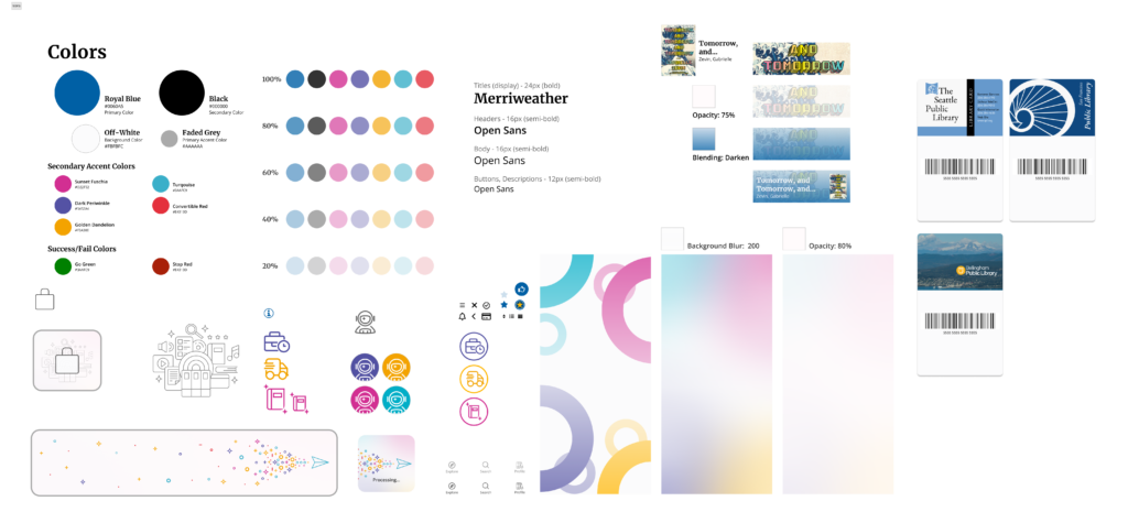
To create an engaging tone with the design, I settled with using a modern yet simple primary color palette to make the design feel intuitive, informative, and natural (not distracting) for users. For the secondary accent colors, the variety and brightness used were to evoke child-like feelings of playfulness and excitement, which I considered an essential component to make the repetitive task of recreational browsing feel entertaining.
Final Product
Introducing a Digital Platform Designed for Rapid Growth


Build your collection
Whether if it’s your favorite or just another interesting read, add the books that make the biggest impression on you to your collection at your own pace.
Share your collection
Even if you borrowed it from the library, bought it from a bookstore, or simply streamed it as an audiobook, no matter; all content can be added to your collections and are available to show off to your friends.
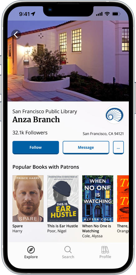
Discover other collections
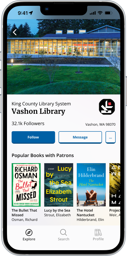
From your library, other libraries, organizations, or editor choices, view what each of them are recommending for your next read.
Find and enjoy new favorites
Centered around what content you have enjoyed the most, we will use that to tailor your explore experience when browsing recommendations.
Connect with others and build your community
Whether its your friend across the country, a family member, or someone you just met at your library, build your community the way you want to help discover your next read.


Next Steps
Detail out user journey in more technical terms.
To get ideas communicated to engineering appropriately, defining data types and how they will interact with each other is essential to building out the platform.
Consider future CTAs for users wanting to borrow or purchase items, and how to approach both of those user journeys.
With the focus specifically on highlighting library communities, understanding how to improve user gratification when finding a recommendation they want to read is crucial to improve retention rates for not just the platform, but for the physical borrowing experience as well.
Expand upon library management tools.
Being able to manage library and borrowing activity digitally not just strengthens the correlation between public libraries and the app for its users, it also creates a competitive edge against other library management services by not being bound to an individual library system.
Determine inter-community engagement experiences.
Considering that public libraries can have a competitive hybrid modality, determining the best way to incorporate sub-communities, “book clubs”, and events in the digital and physical space would continue to further improve and expand the platform.
What I Learned
Articulating Design Needs in an Effective Way
Keep grounded throughout the design process
With all the ideas I had to establish a design, I had to keep reminding myself to stay grounded in my design efforts. In efforts of wanting to have my design be competitive, relevant, and feasible, I was trying to embody a lot of different ideas. This I had to account for when reigning my designs in within its reiteration so it would focus more on the primary user flow of book browsing and discovery.
Make the familiar unfamiliar
Coming into this project I had to acknowledge my own personal bias. Being a part of the “casual reader” users that browse the library for a new book, I needed to take a step backward to observe the bigger picture of the book browsing and recommendation experience. Talking with participants that were more a part of the “enthusiast reader” user group helped me acknowledge that in the end I was not designing for me, it was for all types of readers and library users.
